Creating Power BI Reports & Dashboards Consultancy Services
Building beautiful, engaging dashboards that take you on a journey through your business data
Once you have gathered your data, cleansed, prepared and validated your data, and modelled your data to represent your business the pretty part of your Power BI project can start.

Creating Power BI Reports & Dashboards
Once you have gathered your data, cleansed, prepared and validated your data, and modelled your data to represent your business the pretty part of your Power BI project can start. This is perhaps the bit that many think Power BI is all about, building beautiful, engaging dashboards that take you on a journey through your business data. It is certainly the most visual, visible and obvious part of a Power BI solution, but there is much to do before you get to this stage to ensure that your data is ready and that you can get maximum benefit and effect from your Power BI dashboards.
If you would like to get a bit more insight in to the full data journey to get to the visualisations stage take a look at our Business Intelligence and Data Driven Decision Making roadmap. You may also be interested in finding out how our Power BI consultants can help on your journey.
While Power BI is the visual and obvious front-end of your data solution, managing the pipeline that feeds it is critical. By implementing Microsoft Fabric, you can unify your data engineering, data warehousing, and semantic modelling into a single enterprise platform. This ensures your Power BI reports are backed by a single source of truth like OneLake, removing data silos before design even begins.
Building Power BI Reports & Dashboards
Once we have a well defined business model the process of designing reports and dashboards is relatively straight forward. The most important thing here is that we have a sound understanding of the business data, the purpose of the reports and dashboards, and the stories that are to be told from your business data.
We will start with some simple questions
- Report or dashboard?
- Detail or Summary?
- Static or Interactive?
- Who is the audience?
- Why do they need it?
- How will they use it?
- Where will they view it from?
- Historic or Predictive?
Answering these questions helps us define whether a standalone Power BI setup is sufficient, or if your organisation requires the broader scale of an end-to-end analytics platform. As a Microsoft Solutions Partner, we can architect your solution completely within Power BI or scale it into Microsoft Fabric to combine your data movement, data science, and reporting workloads under a unified, high-performance capacity model. Our Microsoft Fabric consultancy service can fast track you journey to delivering the perfect Power BI Reports and Dashboards and pave the way for introducing AI into your solution as well.
From here we can then start to choose the appropriate reporting tool and platform.
Business Intelligence is about more than simply reviewing historic performance such as sales reports, profit and loss reports, stock positions. It is about using our historic data to pre-empt outcomes and make better decisions
Business data can be used to tell a story of what is going behind the scenes.
- Why is your profit up or down, or particular product out of stock?
- Who is your best customer and what makes them your best customer?
- How accurate are your forecasts? What are the strongest influencers to your sales?
Business data can also be used to predict future behaviours and drive informed business decisions.
- What will our stock requirements be over the next few months?
- What is our expected profit and loss?
- How will a marketing campaign impact future sales?
- Where should you focus your marketing activities?
- What customer demographics should we focus on for maximum sales?
- What resource will we need to fulfil predicted business?
The purpose and audience of a report or dashboard will drive the style of the visuals implemented. Focusing on the story telling and driving business decisions from your data the more interactive and visual the experience is the more useful it is likely to be for the audience.
Designing dashboards is an art. You don't want them too cluttered or too detailed, but equally you want to present all the key performance metrics in a single place and with clarity. You also want to enable the viewer to drill down into the data to answer questions they may have such as which stores are pulling your sales figures down, or which products have contributed to a bumper month.
The reporting platform selected for your business intelligence solution must provide a good variety of visuals that can satisfy all of your dashboard needs. Here are a few examples.
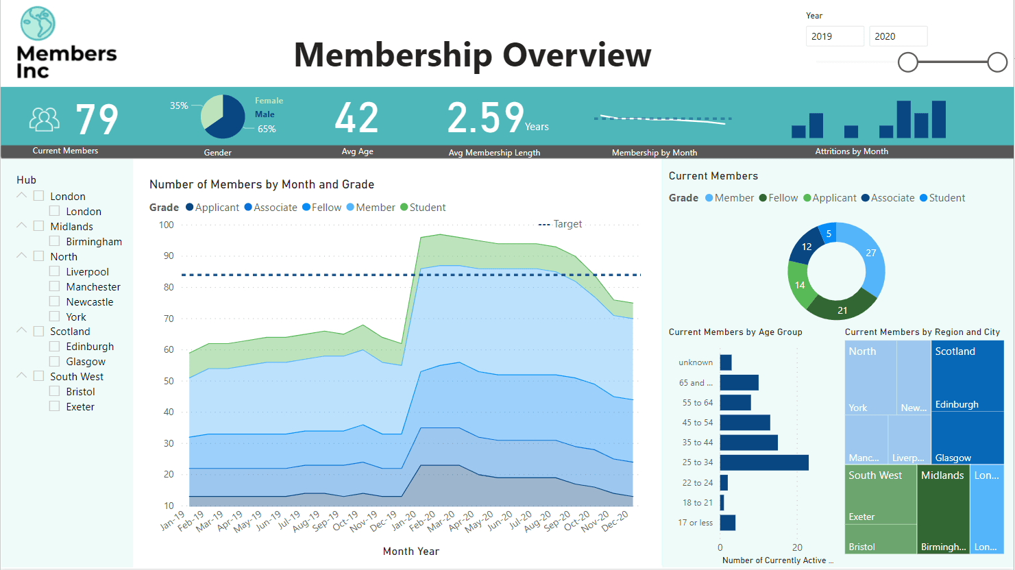
The following dashboard includes a mix of score cards, charts, tree maps and slicers to present an overview of membership statistics.
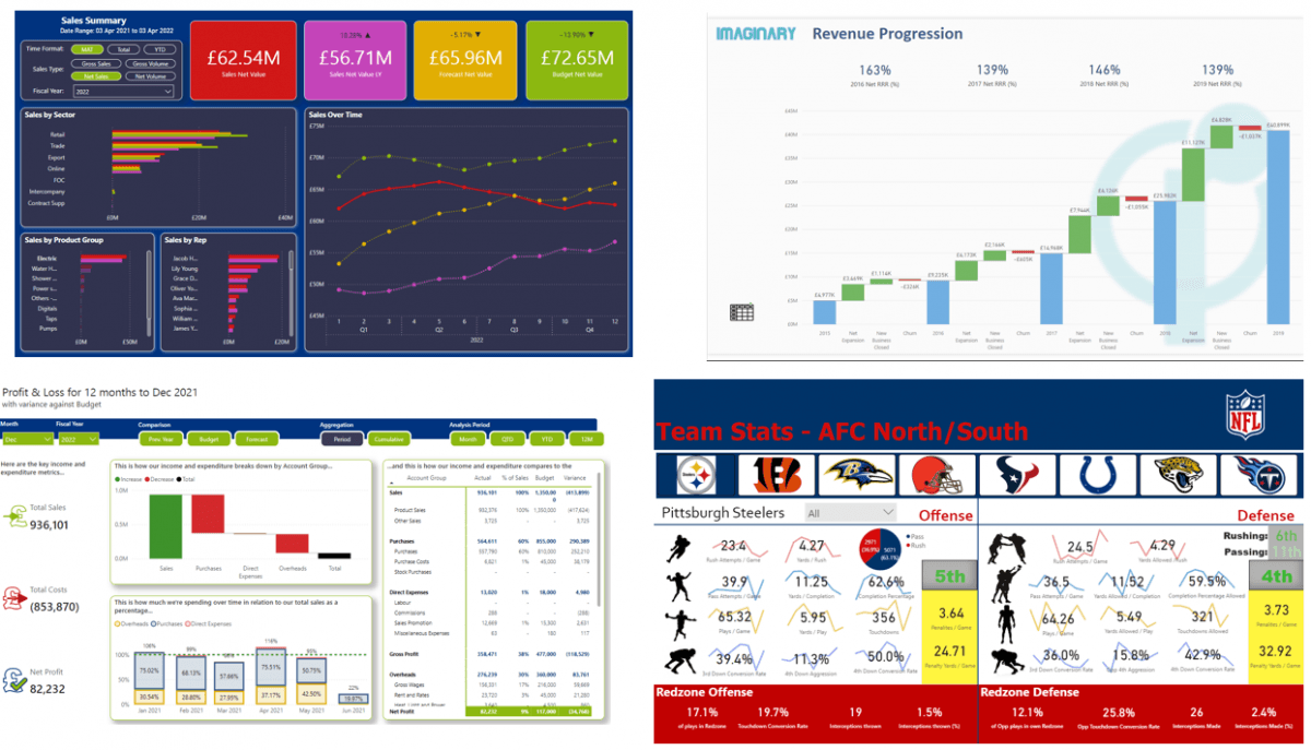
We see a variety of dashboard examples below from revenue, project management, membership and weather data sets.
Designing Power BI Reports - Where do you start?
Share This Page
Articles you may be interested in

Frequently Asked Questions
Couldn’t find the answer you were looking for? Feel free to reach out to us! Our team of experts is here to help.
Contact Us