
Tech Tips
How to Monitor Your Microsoft Fabric Capacity
One greedy job can slow every report on a shared Fabric capacity. Learn how the Capacity Metrics app, Real-Time hub alerts and the Monitor hub work together, including the new preview features announced at FabCon Europe.

Microsoft Fabric gives you one shared pool of compute, and every workload, from Spark notebooks to Power BI reports, draws from it. That flexibility has a catch: one greedy job can leave your report users staring at a spinning wheel. In our experience, plenty of Fabric capacities run with little or no monitoring, and the first anyone hears of a problem is a user complaining that a report won't load.
Fabric now gives you the tools to see trouble coming. Here's how we monitor capacities for our clients, using three tools that each do a different job:
- The Capacity Metrics app is a detailed record of where your capacity went, and its new experience makes trouble easier to spot at a glance.
- Real-time alerting warns you in near real time, rather than after the damage is done.
- The Monitor hub shows what ran, when, and whether it succeeded.
A quick note before we start: several of the newest features below are in preview, which we flag as we go. Preview features may change, and you may not see them in every region yet.
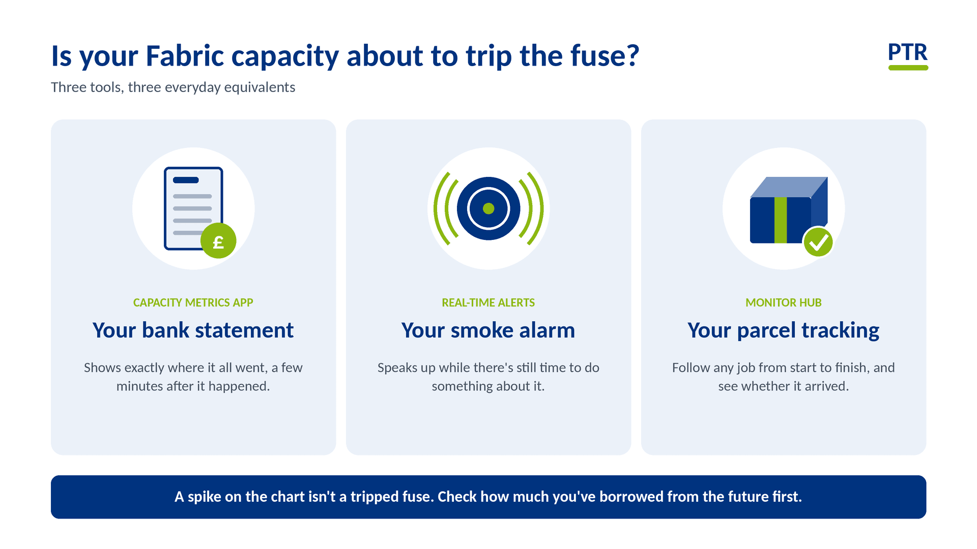
Prefer the plain-English version? Our companion article, "Is Your Fabric Capacity About to Trip the Fuse?", explains the same ideas with everyday analogies. (link to be added on publish)
Step 1: Get to know the Capacity Metrics app
The Microsoft Fabric Capacity Metrics app is the main tool for understanding how your capacity is being used. It's a free Power BI app from Microsoft, and you need to be a capacity admin to install it.
Where we'd start in the default report:
- Health page: an overview of the capacities you administer, so you can spot the ones under strain.
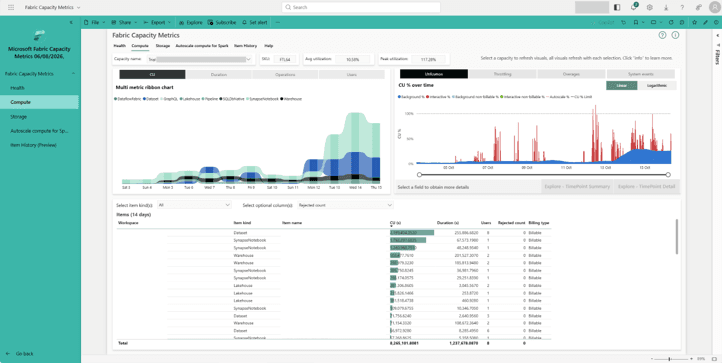
- Compute page: a 14-day view of utilisation, peak loads and throttling. The ribbon chart is split by workload type and is interactive: click a segment and the Items table below filters to show which items used the most CU.
- Timepoint and Timepoint summary pages: drill into a single 30-second timepoint to see which operations, interactive or background, used the most compute.
- Autoscale compute for Spark: shows how much Spark work ran on pay-as-you-go compute, if you've switched Autoscale Billing for Spark on. This usage isn't smoothed.
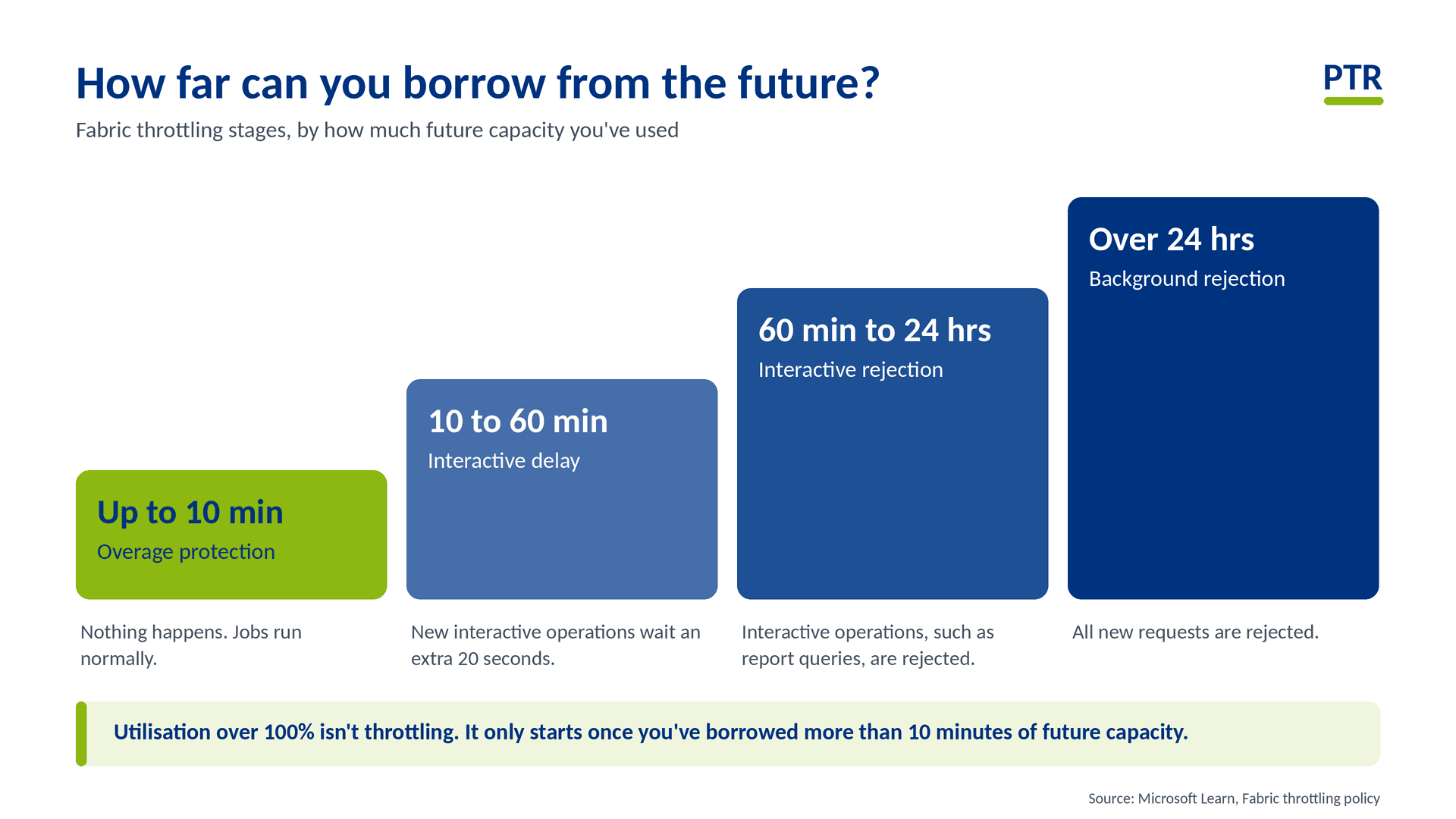
The most important lesson: utilisation over 100% doesn't mean you're being throttled. Fabric lets jobs borrow from future capacity and spreads the cost over time, known as bursting and smoothing. Background operations are smoothed over 24 hours, and interactive operations over a minimum of 5 minutes (up to 64, depending on how much they use). Throttling only starts once you've used up more than 10 minutes of future capacity, so the Throttling chart is the best place to check next: it shows how much future capacity you've already spent.
Stage | Future capacity used | What happens |
Overage protection | Up to 10 minutes | Nothing, jobs run normally |
Interactive delay | 10 to 60 minutes | New interactive operations are delayed by 20 seconds |
Interactive rejection | 60 minutes to 24 hours | Interactive operations are rejected |
Background rejection | Over 24 hours | All new requests are rejected |
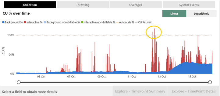
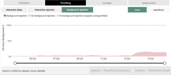
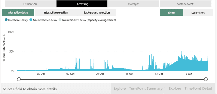
It's also worth looking at interactive and background usage separately. Interactive operations, such as report queries, are smoothed over a much shorter window, so they feel pressure first. When throttling starts, report users notice through delays and then rejected requests.
How fresh is the data? Microsoft says usage data generally appears within 10 to 15 minutes, so it's close to live but not real time. The lists of capacities, workspaces and items refresh at midnight local time, so a workspace you've just moved won't show under its new capacity until the next day, unless you refresh the app's semantic model manually.
Why it matters: this is the best bird's-eye view of how all the workloads on your capacity perform together. It should inform any decision about resizing a capacity and tell you which workloads to optimise first. When something goes wrong, the Timepoint drill-through usually points straight at the culprit, often a single notebook or refresh doing far more work than anyone realised.
Try the new Metrics app experience (preview)
At FabCon Europe 2026 in Barcelona (28 September to 1 October), Microsoft announced a redesigned Capacity Metrics app. At the time of writing, Microsoft describes it as a preview. When you install the new version, it appears as an additional option alongside the existing report, so you can compare the two.
The biggest improvements we've seen so far:
- Health page: an admin can land here and quickly identify the capacities most in need of review. New measures such as health-state duration, which shows how long a capacity has spent in each state, sit alongside existing ones like average utilisation. This is a far easier number to explain to business users than a carryforward percentage.
- Compute page: the utilisation chart now shows CU per second rather than a percentage, so you can see clearly when a capacity was scaled up or down. New daily and hourly heat maps show when the capacity is busiest, which is ideal for spotting the "every evening at 7pm" pattern. Top-contributor views show which items had the biggest impact.
- Item details page: builds on the existing item history page, with key insights for an individual item running on the capacity.
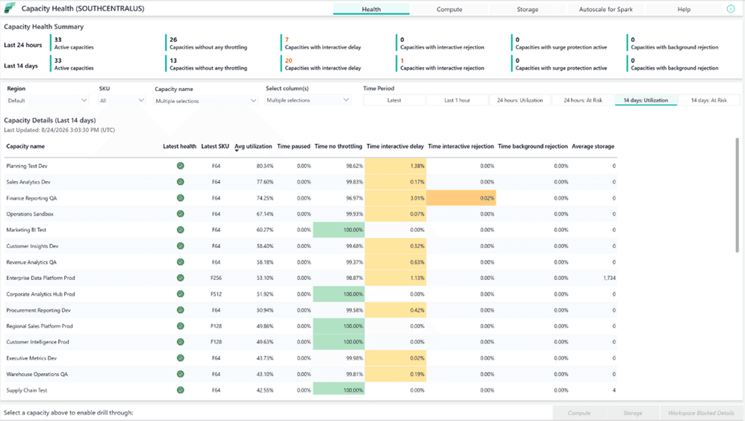
Why it matters: the default report is thorough but takes practice to read. The new report is designed to be read at a glance, which makes it far easier to share with people who aren't Fabric specialists.
Step 2: Set up real-time alerting
The Metrics app doesn't support alerts or notifications. It tells you what happened, but it won't warn you as it happens. For that, you need the Real-Time hub.
- Capacity overview events stream your capacity's health in near real time. Connect them to Activator and you can get a Teams message or email when, say, the interactive delay level approaches 95%. Microsoft's own example does exactly this.
- Capacity operation events (preview) go a level deeper, emitting one event per operation that uses capacity, with the workspace, item, CU consumption and throttling delay, so you can alert on individual operations.
- The new capacity alert experience in Real-Time hub is generally available and provides ready-made templates for common scenarios, so these alerts are much quicker to set up than building them yourself.
- Capacity notifications in the capacity settings of the admin portal can show a banner to all users while a capacity is throttled or recovering, and email your capacity admins (the email option is in preview).
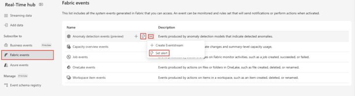
Why it matters: an alert gives you a heads-up while there's still time to act, rather than waiting for the first user complaint.
Step 3: Use the Monitor hub, old and new
The classic Monitor hub is the run history for your Fabric items: pipelines, notebooks, dataflows and refreshes. You can see what ran, what's in progress, when it started, how long it took and whether it succeeded. That lets you join up a capacity spike in the Metrics app with the specific run that caused it. Spark notebooks, for example, can use a lot of CU if they aren't written efficiently, and from the Monitor hub you can open the Spark UI to see exactly which activities are responsible and where to make savings.
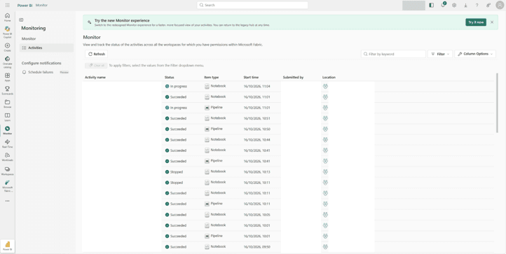
Recent additions make it more useful for real-world pipelines. Hierarchical navigation lets you follow a pipeline run up and down its chain of parent and child runs. If you've ever tried to trace which of twenty nested notebook runs went wrong, you'll appreciate that.
The refreshed Monitor hub (preview), announced at FabCon Europe, goes further. It adds health views across workloads, jobs, apps, agents, alerts and capacities, so capacity headroom sits next to job status. Alongside it, Capacity Insights and Actions (also preview) is designed to let admins act from the same screen, for example by adjusting surge and overage settings, migrating workspaces or resizing the capacity. Microsoft's guidance is to use the Monitor hub for monitoring and operational decisions, and the Capacity Metrics app for deeper usage analysis.
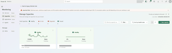
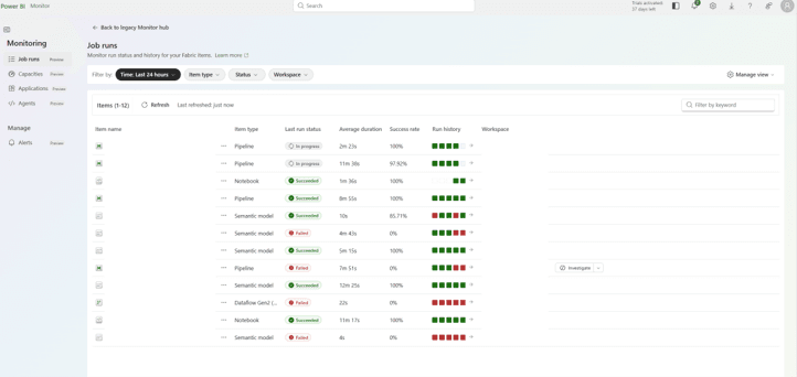
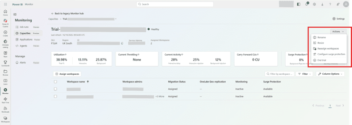
Why it matters: the Monitor hub shows what's running now and what ran before, so you can trace a capacity spike back to the exact run that caused it.
Putting it together: a simple monitoring routine
Here's the rhythm we recommend:
- Check the Health and Compute pages regularly. If you've installed the new Metrics app experience, use that. Look at health-state duration and the heat map for patterns that keep repeating.
- Investigate spikes properly. Drill from the spike to the item in the Metrics app, then to the specific run in the Monitor hub.
- Separate interactive from background. They're smoothed and throttled differently, and report users feel interactive pressure first.
- Rank by CU consumption, not run time. A short run time doesn't necessarily mean an efficient job.
- Set up alerts. Real-Time hub alerts and capacity notifications mean you hear about trouble before your users do.
- Give it an owner. Make capacity health a standing agenda item for whoever owns the platform, not something that only gets attention when people complain.
One more lesson from our own Fabric projects: measure every optimisation rather than assuming it worked. We've seen "lightweight" pipeline replacements for heavy notebooks make no real difference to capacity, and we've seen a simple change, like moving table maintenance to an overnight schedule, make a noticeable one. Measuring with these tools meant we knew which changes worked for our workload pattern instead of guessing.
Summary
- Use the Capacity Metrics app to see who used your capacity, and watch the Throttling chart, not just utilisation.
- Try the new preview report for a faster health check, heat maps of busy hours and item-level insight.
- Use Real-Time hub capacity events and capacity notifications for alerts, because the Metrics app can't send them.
- Use the Monitor hub to tie capacity spikes back to specific runs, and keep an eye on the refreshed preview.
- Make monitoring a regular habit with a named owner.
How PTR can help
Reading capacity data is a skill. PTR combines hands-on Fabric consultancy with training, so we can review your capacity with a Data Platform Health Check, set up monitoring and alerting that suits your workloads, and train your admins and report creators to read the numbers themselves.
If you'd like a second pair of eyes on your Fabric capacity, or help putting a regular review in place, get in touch.
HM
Hayley Mclaughlin
Business Intelligence Consultant
With over seven years in data and analytics, Hayley specialises in end-to-end BI implementations, from design and development to delivery and support.
Frequently Asked Questions
Couldn’t find the answer you were looking for? Feel free to reach out to us! Our team of experts is here to help.
Contact Us