Blog Post
SQL Server 2016 - Creating Charts with R

Plotting Charts With SQL Server R Service
Yesterday I posted a blog article about the R Service available in SQL Server 2016 and showed an example of using regular expressions with the stringr R library.
In this blog I am talking about how R can be implemented for chart plotting purposes in SQL Server.
Dashboards from SQL Server Data
Generally if we want to produce a dashboard style report with graphics such as bar charts we would import the data into an Excel workbook or create an SSRS report based on a SQL query data set, or import data into PowerPivot or PowerBI to enable charts to be generated.
The R service provides us with the ability to generate charts directly from TSQL scripts or Stored Procedures.
Instead of having to transfer and transform data via a data warehouse or a staging database, complex statistical analysis and chart plotting can be carried out directly on the relational data in place in a relational database via TSQL scripting.
One of the libraries included with the SQL Server R Service is the graphics library which includes various functions for plotting charts. A second library called lattice extends the plotting options.
The following code is taken from the Microsoft Tutorial on the R Service. The sample database used for this tutorial holds data for a taxi firm. A single table of data stores records of every passenger journey as shown below:
The following stored procedure creates a JPEG and two PDF files containing charts derived from the taxi data table.
The data set used for the charts is derived from a SELECT statement which is assigned to a variable @query at the start of the stored procedure code:
At the end of the sp_execute_external_script call (last but one line) the parameter @input_data_1 is assigned the value in the @query variable:
The charts depict the ratio of passengers who tip versus those that don’t tip, and comparisons of fare amounts and tip amounts.
The three charts (files) produced are shown below. The first two are generated using the hist function from the graphics library. The third is generated using the plot function from the lattice library.
Single Plot Area Histogram
The file called rHistogram_Tipped_14e02a6623a3.jpg contains a histogram showing the proportion of passengers that did not tip and did tip taxi drivers:
The following section of the R script code creates the histogram in the .jpg file:
The first four statements prepare and create the .jpg file.
The fifth statement is the call to the hist function. The hist function has five arguments being passed to it:
The first argument is defining the column form the input data set to use (the tipped column from the SELECT statement)
The second argument (col) defines the colour of the bars on the histogram
The third argument (xlab) defines the title/label for the x axis
The fourth argument (ylab) defines the title/label for the y-axis
The fifth argument (main) defines the title for the chart
There are a number of other arguments supported by the hist function to carry out changes such as customising the scales on the axes.
Two Plot Area Histogram
The file called rHistograms_Tip_and_Fare_Amount_14e068f4416.pdf contains two histograms showing fare and tip amounts:
The following section of the R script code creates the PDF document containing bar charts showing fare and tip amounts:
The first three statements prepare and define the PDF file.
The fourth statement shows the par function being called to define a muli-paneled plot area with 1 row and 2 columns (two charts side by side)
The fifth statement show the call to the hist function to create the histogram for column one of the plot area.
The sixth statement shows the call to the hist function to create the histogram for column two of the plot area.
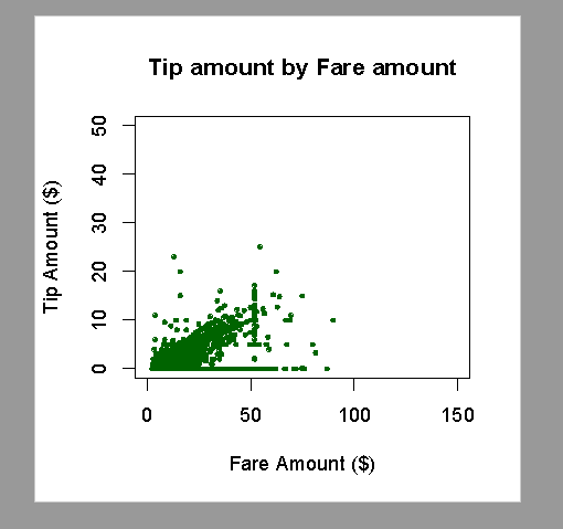
Scatter Chart
The file called rXYPlots_Tip_vs_Fare_Amount_14e049221ae7.pdf contains a scatter chart showing fare and tip amounts:
The following section of the R script code creates the PDF document containing a scatter chart showing fare and tip amounts:
The first four statements are preparing the PDF file.
The fifth statement calls the plot function (from the lattice library). There are ten arguments being passed into the plot function:
The first argument defines the two values to represent on the y-axis (Tip Amount) and x-axis (Fare Amount). The names used here are the column names from the dataset select statement
The second argument (data) associates the data set with the chart, but also limits it tow use the first 10000 values (records)
The third argument (ylim) is the maximum value to be represented on the y-axis
The fourth argument (x-lim) is the maximum value to be represented on the x-axis
The fifth argument (cex) defines teh character size for axis labels
The sixth argument (pch) defines the plotting character
The seventh argument (col) defines the colour of the plot points
The eighth, ninth and tenth arguments define the labels for the chart and the axes
This gives you a bit of an insight into how R scripting can be integrated with SQL Server TSQL scripts and queries to produce external files such as .jpg and .pdf files.
Would you like to learn more about SQL Server and R Scripting? Email us at info@ptr.co.uk to see how we might be able to help you.
Share This Post
Mandy Doward
Managing Director
PTR’s owner and Managing Director is a Microsoft MCSE certified Business Intelligence (BI) Consultant, with over 30 years of experience working with data analytics and BI.


Frequently Asked Questions
Couldn’t find the answer you were looking for? Feel free to reach out to us! Our team of experts is here to help.
Contact Us