Tech Tips
Story Telling With Beautiful Dashboards
Concise & visual insights can provide clarity on business processes and performance and help to drive business decisions. Interactivity enables us to see how different subjects of interest influence the facts, and how they relate to one another.

Story telling with data relies on clean well organised data, a clear idea of the business metrics we want to interrogate plus a semantic model that give these measurables business meaning. Only then can we start to create a strong business story.
Let's assume that the data required to deliver a beautiful story telling dashboard has been located, prepared and modelled appropriately. What remains is for the story telling to begin and a dashboard to be designed.
There are a few golden rules when designing a dashboard to deliver successful story telling and data driven decision making.
See the Big Picture! Don't start with the detail.
- What's your story?
- Build your semantic model
- Plan your dashboard
- Concise & visual insights can provide clarity on business processes and performance and help to drive business decisions
- Interactivity enables us to see how different subjects of interest influence the facts, and how they relate to one another
- Don’t start with too much detail
- Work your way down into lower levels
What's Your Story?
When choosing a story for a dashboard think about what is important to your business
- What are your main business KPIs & performance targets?
- Can you measure them?
- What are the subjects of interest?
- What can’t you see at the moment?
- What questions can’t you answer?
- What is the business impact?
Build Your Semantic Model
Identify Your Business Metrics & Subjects of Interest
“Facts” refer to the data we want to measure e.g. how much, how many, how often?
- What are your metrics?
- What are the facts behind your metrics?
- How exactly do you define them?
“Dimensions” refer to the data we use to group and slice the facts e.g. who, what, where, when?
- What are your dimensions and where do you find them?
- How do they relate to your metrics?
- What are your hierarchies?
Locate The Data
- What data do we have already?
- Where is it and how can we collect it?
- What data are we missing?
- How can we find it?
Build your semantic model to feed your dashboards.
Plan Your Dashboard
- Create a template layout
- Build a theme defining your colour palette
- Identify your headline and objectives
- Plan your page to be visual, interactive, and show business impact.
Concise & Visual Insights
Useful visuals for presenting a high level view of data to support a story headline might be funnels, charts and score cards:
Interactivity
Enabling the user to interact with the visuals will assist with question and answering, and uncovering data correlations and relationships.
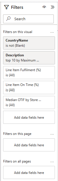
You can make dashboards interactive through slicers, buttons and filters.
You can also encourage user engagement with reactive visuals that interact with one another to reflect any slice a user wishes to look at.
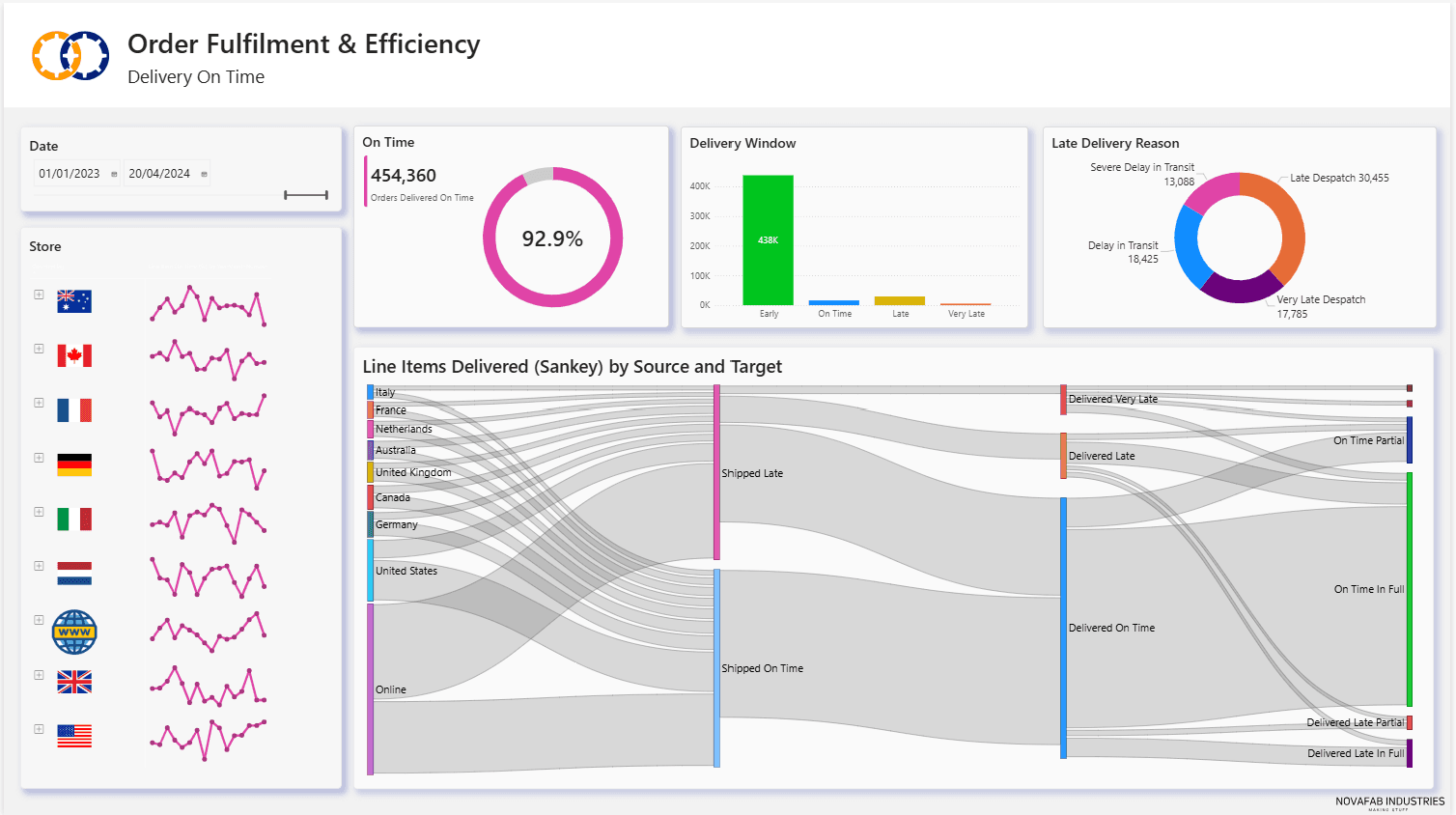
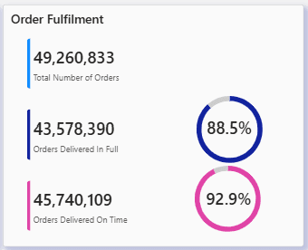
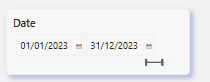
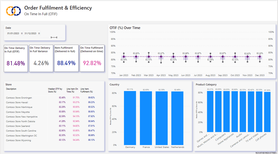
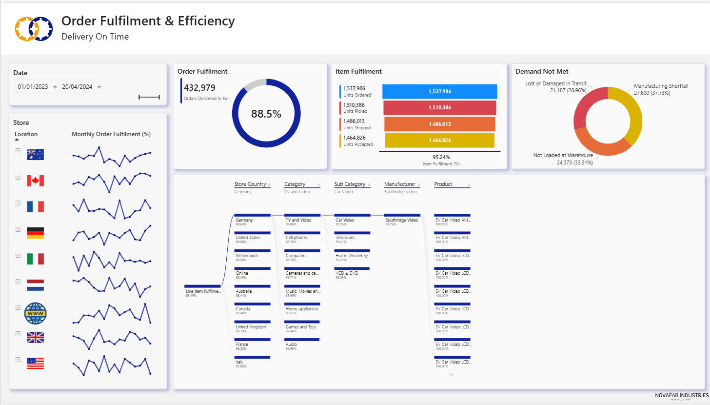
Here we see a page that reflects delivery and on time performance (On Time In Full - OTIF) for the whole of 2023 (controlled by a date slicer) and for all countries, products and stores.
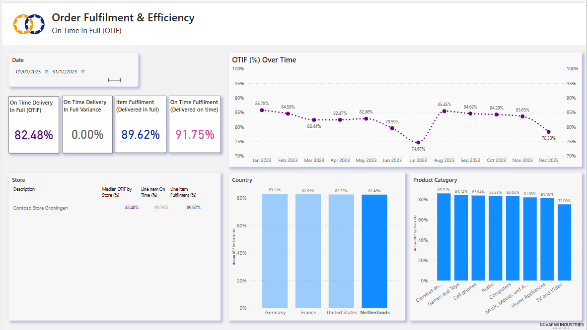
In the next screen shot we see that Netherlands has been selected in the Country bar chart visual and all the other visuals have adapted to show only data relating to Netherlands:
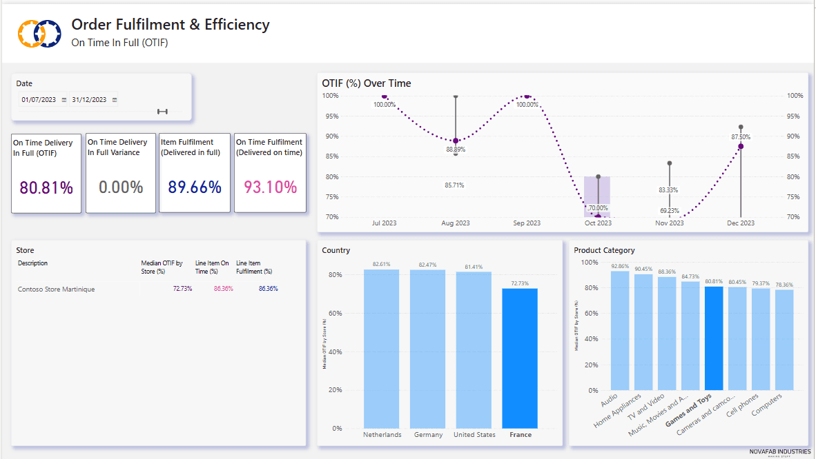
Below we see that France and Toys and Games have been selected in the Country and Product charts, and the last 6 months of 2023 have been selected with the date slicer - all other visuals now show only data relating to Jul to Dec 2023, France and Toys & Games:
Don't start with too much detail
Keep to one headline per page in your dashboard. In our sample dashboard we are focusing on delivery performance and not the reasons behind those delivery statistics. We may have several visuals enabling us to see the impact of delivery performance over time, or by country or by product, but we are focusing only on how well we have performed in fulfilling customer deliveries in full and on time.
Save the detail of why our delivery performance is low, or what has driven fantastic delivery performance for a separate report page.
In many cases an initial headline page for a report might be as simple as a set of score cards alone showing the core KPIs for your business.
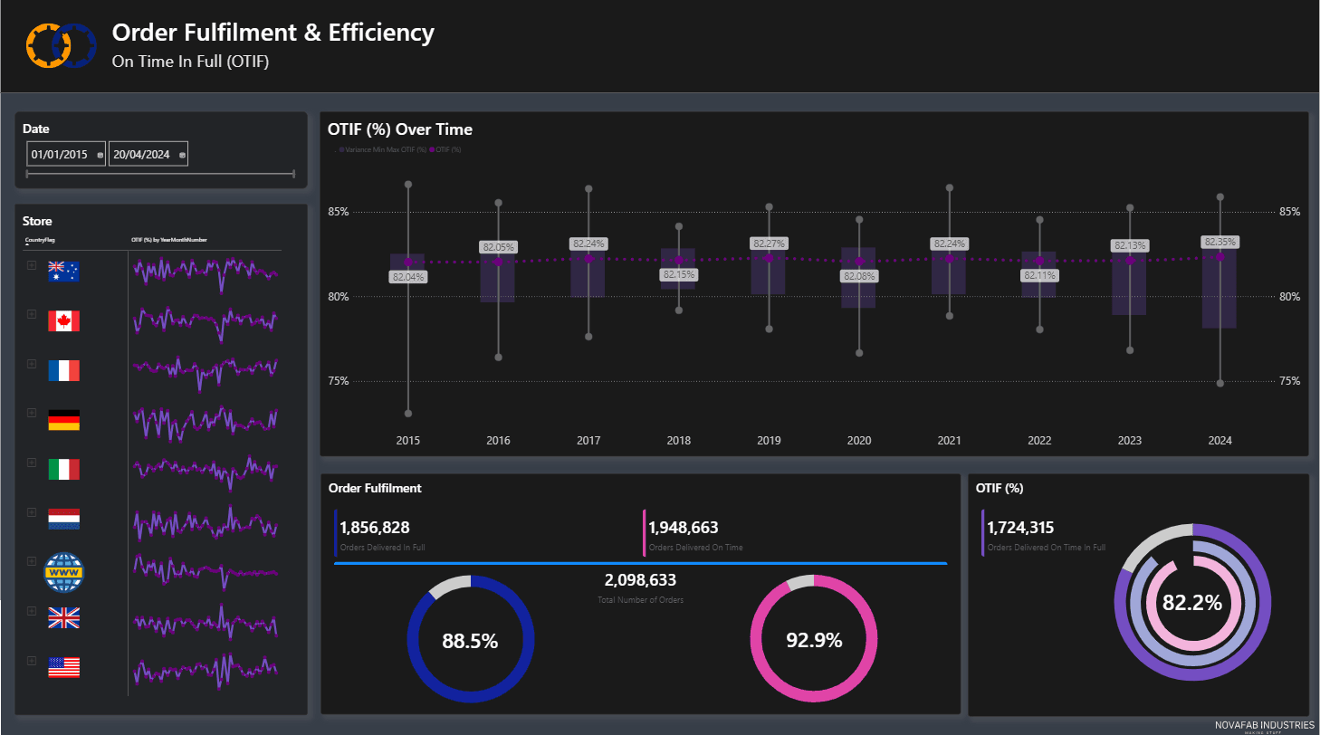
Here is a variation of the dashboard page shown above.
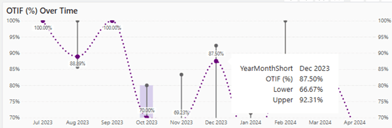
One method to convey more detail without cluttering a page and avoid diluting or confusing the main story is to use tool tips which enable a user to see more details when they hover over a part of a visual such as a bar or line on a chart.
Work your way down into lower levels
When you get to the why and the how you are starting to work your way down from the top to the details that can provide answers.
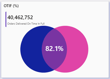
In our OTIF example we might have separate pages to encourage the investigation into why we are not delivering all items or why we are delivering early or late.
This page explores delivery promptness - we can see some of the reasons for late deliveries that are affecting our OTIF scores:
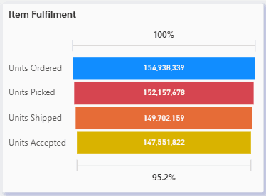
Whereas this one focuses on incomplete deliveries and shows where we are losing items to picking, shipping and acceptance issues:
Beautiful Dashboards Conclusion
The recipe for success:
- Stick to your story! What, where, when.
- Keep it simple!
- Make your story obvious
- Use a consistent layout and consistent colours
- Invite users to interact
- Provoke thought and questions! Why, how?
If you would like some advice and guidance with telling your stories, whether it be preparing the data or building beautiful dashboards contact us at info@ptr.co.uk or call us on 0118 979 4000.
MD
Mandy Doward
Managing Director
PTR’s owner and Managing Director is a Microsoft certified Business Intelligence (BI) Consultant, with over 35 years of experience working with data analytics and BI.
Related Articles

Frequently Asked Questions
Couldn’t find the answer you were looking for? Feel free to reach out to us! Our team of experts is here to help.
Contact Us