
Tech Tips
Visualising Data & Story Telling
With a well-designed semantic model representing your business logic and key performance metrics, you are well placed to extract the hidden stories and useful insights your business data conceals. Now it’s time to visualise your modelled data.

With a well-designed semantic model representing your business logic and key performance metrics, you are well placed to extract the hidden stories and useful insights your business data conceals. You can catch up with how we got there in the links below.
Now it’s time to visualise your modelled data using a tool such as Power BI - to help you uncover or reveal previously unspotted trends, saving you hours of time! No matter what business you’re in, there’s a world of value ready to be uncovered. Here are some examples;
- Retail: Discover hidden correlations like the effect of the weather on product sales, or the impact of different product display locations.
- Membership organisations: Identify areas where membership engagement is poor and the effect that has on membership attrition.
- Manufacturing: identify the impact of factors such as temperature or humidity on equipment failure.
- E-commerce: discover the reasons behind abandoned carts and the impact of certain apps.
- Medical: identify geographical correlations with certain medical conditions.
- Education: make connections between different methods of student engagement and course success.
- Banking: Is credit card fraud correlated to time of day - Is app engagement linked to customer churn?
- Charity: does the time of day a campaign is sent out have an impact on donations?
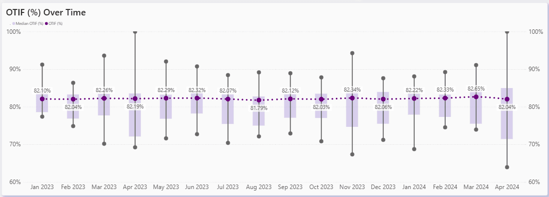
- Supply Chain: measure performance in delivering in full and on time (OTIF)
Even if these stories were already on your radar, it takes a long time to collate and analyse all the data you need. With BI tools you can confirm your conclusions fast and then make precise, practical decisions about the next steps.
Planning for Successful Data Story Telling Using Interactive Dashboards
Like any successful story, your data narrative needs some planning to guide your audience through the key insights. Overcomplicated work may leave your business audience wondering what they’re looking at so you want to create a journey they can follow and understand.
Here we outline the core steps to successful story telling at a glance – then we’ll look at these areas one by one in more detail.
Step 1: Identify the story you wish to tell.
Step 2: Implement a well-designed semantic model that represents your business language, business logic and the business hierarchies you use to create your KPIs.
Step 3: Identify your story headline and the story arc, including the beginning, middle and end, and then stick to your story. Consistent, clear and simple.
Step 4: Think about what? when? who? how? why? Do you have everything you need to tell your story well?
Step 5: Design and build your dashboard. Choose the right visuals to convey the message and take the viewer on an interactive journey organised around questions and answers. Plan your dashboard layout for maximum impact and insight with a consistent style, colour palette and page layout.
Step 6: Review, test and tweak your dashboard layout - Can a first-time viewer understand the message you want to convey within 20 seconds, if not you could be wasting your time! Keep the message simple and consistent. Avoid the temptation to over-complicate and throw in the kitchen sink. Always think of your end users.
Step 7: Publish your dashboard to the interested audience.
Step 8: Get a head start in becoming a data first organisation by investing in training for this new way of working. Show people how the reports work and increase your chances of user adoption.
Step 9: Measure your success – monitor and track the success of your dashboards to make sure they are being used.
Now let’s look at those 9 steps in more detail so you can deliver interactive business stories like a pro.
Step 1: Identify the stories you wish to tell
One of the most common mistakes is to try and put too much into a single report or dashboard. If they’re cluttered, they can become overwhelming or even conceal the real story. Once you’ve identified your data story it’s important to stick to it and keep dashboard pages clear and simple.
Think about where your story starts – what’s the opening question and where does it lead? What is the ultimate objective for this dashboard? All related questions should lead to a corresponding answer.
If new stories are uncovered during this process, which is often the way, don't be tempted to include them in this report as well. They belong in a a separate report. For example:
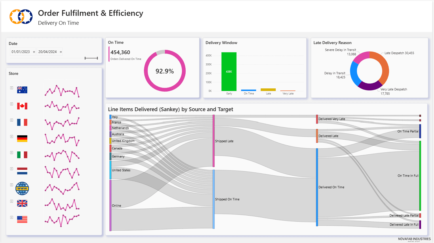
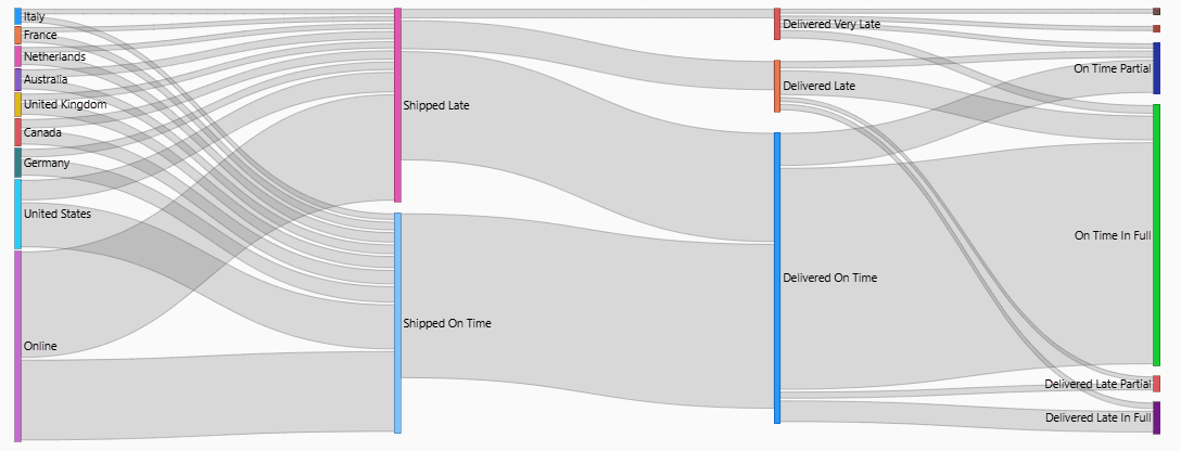
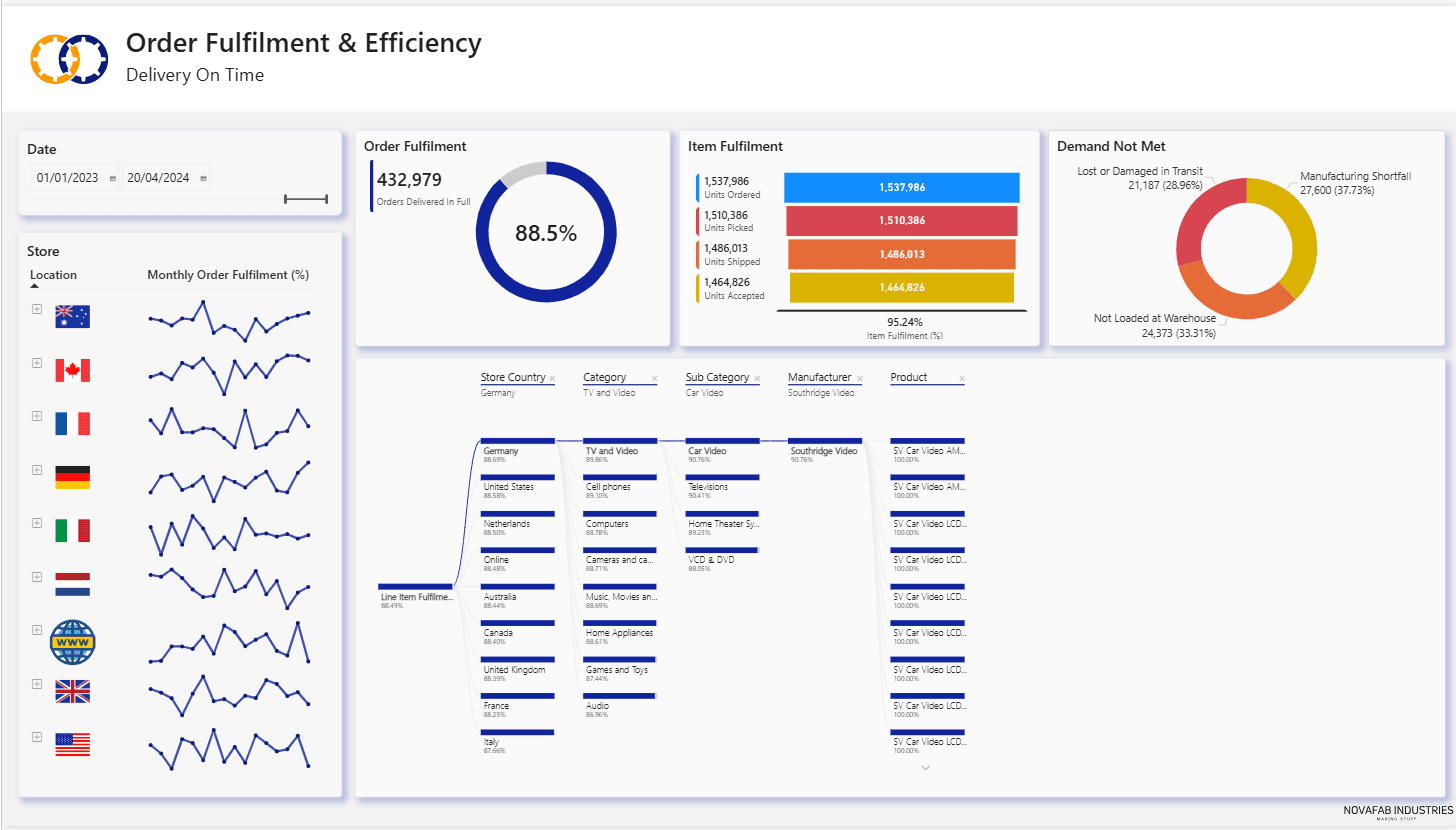
Visualising Order Fulfilment - OTIF
In a dashboard designed to show an order fulfilment journey, the original question might be:
- "What proportion of customer orders do we actually ship in full and on time? - referred to as On Time In Full (OTIF) in supply chain"
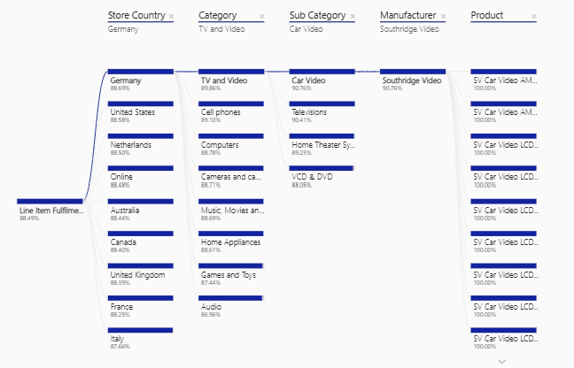
Our main story here, is perhaps to look at the fulfilment proportion by country, by year and by month. Our goal might be to identify if we have order fulfilment issues that are impacting our full sales revenue and profitability potential in certain countries. An extension of this story might be to look further into order fulfilment performance by customer, and by product.
Here is a potential headline page for an OTIF report.
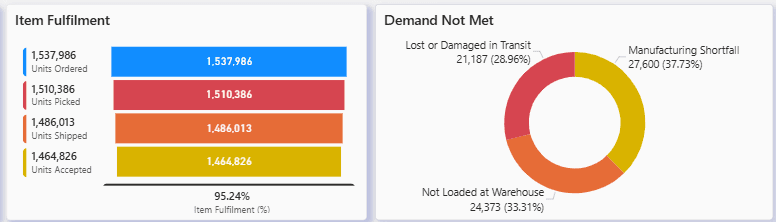
Whilst investigating this story by showing customer order quantities, picking quantities, shipped quantities and invoice quantities we may identify some shortfalls in the process of picking, shipping and customer acceptance or quality, perhaps for different times of the year, or specific countries, and then further understanding of issues by looking at specific customers, or specific products. Questions lead to answers, and answers lead to new questions!
For example:
At the higher level:
- Why are we not achieving 99% or higher for delivering in full and on time?
- Are there certain rimes of the year with worse OTIF scores than others?
- Why are some countries showing a worse order fulfilment performance than others?
- Why are deliveries consistently late at some times of the year?
- Why are deliveries being picked short?
- Why are there high instances of deliveries being rejected in some countries?
At the more detailed level:
- Why are we always shipping less than the customers ask for in July and August?
- Why are we always shipping less than a particular customer is asking for?
- Why are we consistently seeing items rejected by customers for a particular product?
These three questions are all new stories raised by the headline on order fulfilment – “What proportion of customer orders do we actually ship in full and on time? “
The high-level order fulfilment dashboard has handled the what, when and who. Now we are getting into the why and the how. We now have the potential to build NEW dashboards that investigate these aspects. This is where we can really deliver business value with data driven insights and decisions.
What are the hidden insights to be uncovered?
- Is annual leave in July and August impacting our ability to manufacture, pick or deliver products to customers. A dashboard on shift patterns and manufacturing, picking and delivery capacity would tell us, and then enable us to make changes to staffing and shift patterns to accommodate customer requirements.
- Do we have a customer with repetitive high product demands and a lack of stock to fulfil? A dashboard on stock levels, manufacturing or supply levels against demand might show where we can increase production or purchase orders to enable us to fulfil customer orders in their entirety.
- Do we have a quality issue with a particular product which is leading to returned products and credit notes being issued? A dashboard that shows return rates and reasons might highlight product issues and enable us to pursue improved quality controls or switch suppliers for better quality products or parts.
These are all examples of hidden insights which have not previously been visible. Analysis opens up visibility to a wider range of stakeholders and reveals the correlations. Now action can be taken resulting in improved profitability and performance.
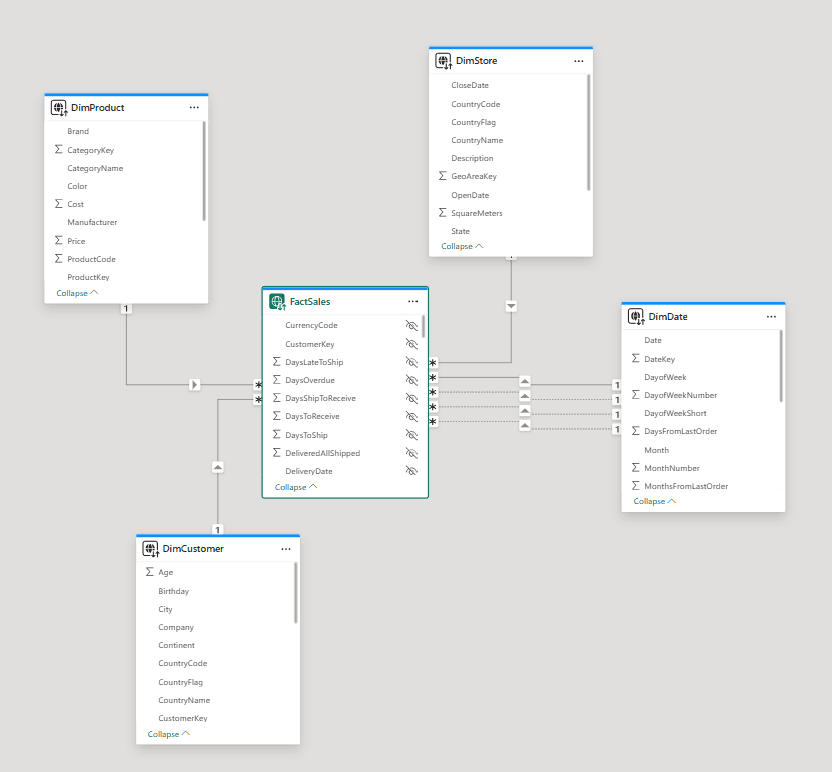
Step 2: Implement a well-designed semantic model
We have featured importing, cleansing, transforming and modelling business data in previous articles, so we won't talk about that again here, but do have a read through the following for more information on building your semantic model.
Your data stories will drive the semantic model design as each data story requires multiple data sets and business measures.
Step 3: Identify your story headline
Your choice of story headline drives the starting point, the desired conclusion and the questions and answers that are required as a part of the story.
In our example from Step 1 our story headline would be:
"Order Fulfilment (OTIF) - What proportion of customer orders do we actually ship in full and on time?"
Step 4: Think about the what? when? who? how? why?
With your headline selected, you can then focus in on the main business KPI of interest. When did events related to this metric take place, who does the business metric affect, how does the business metric affect your business and why does a business metric have a certain value?
The How and the Why might lead to further dashboards.
In our example from Step1 we might have the following:
What?
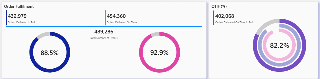
- What is the proportion of customer order quantity shipped?
- What is the proportion of quantity shipped that is accepted by the customer?
- What is the proportion of customer order quantity accepted?
- What is our overall OTIF (on-Time In-Full) Score?
- Allow the report user to see all the above metrics by product category and product.
When?
- Allow the report consumer to view all the above metrics by year, month, week and date.
Who?
- Allow the report consumer to see all the above metrics by business type and customer.
- Allow the report consumer to see all the above metrics by location and customer.
How?
- How can we use this information to improve business operations and decisions?
Why?
- Why are we seeing ordered products not shipped at certain times or for certain customers or products?
- Why are shipped products not being accepted for certain customers or certain products?
- Why are we delivering late?
- Why are we not delivering in full?
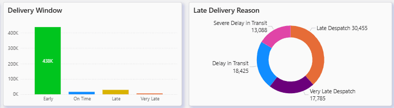
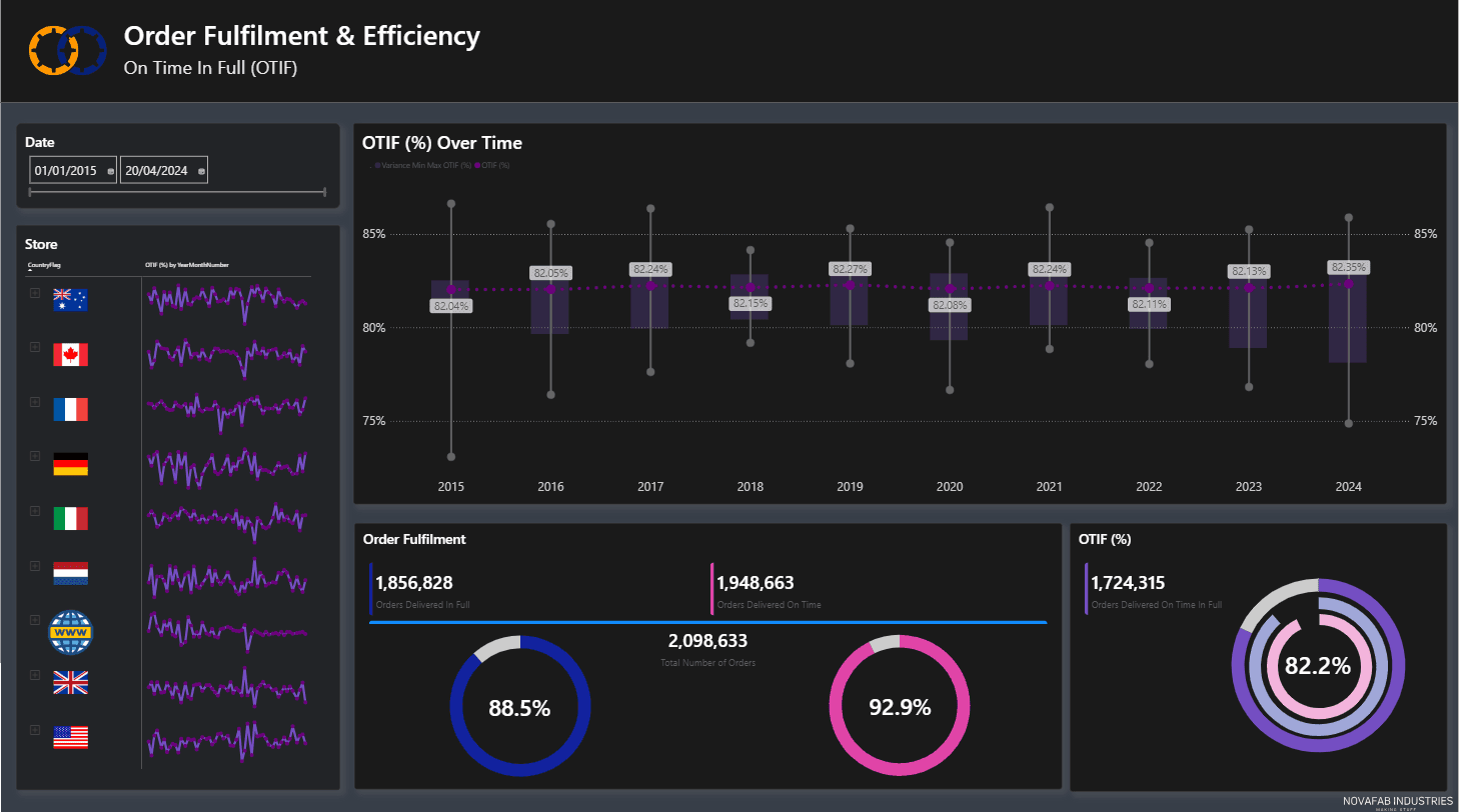
In our sample OTIF Dashboard we might include a Delivery On Time page to investigate why we are not achieving high Delivery on Time rates.
And we might include a Delivery In Full page to investigate why we are not achieving high Delivery in Full rates.
Step 5: Design and build your dashboard
Dashboards are generally made from a collection of visuals, where a visual is an object such as a table, matrix, chart or map. Choosing the right type of visuals to convey the message of your story will ensure that you can take the viewer on an interactive journey of questions and answers.
Your business dashboards will benefit from a standardised layout so that users can instantly comprehend how to view and interact with it regardless of where in the business they come from.
For example:
- Place and present your headline (What?) visuals consistently
- Use the same location and style for all filters and slicers placed on the page
- Place your impact (What?, When?, Who?) visuals consistently
- Ensure your dashboard pages encourage interaction, investigation and questions (Why?, How?)
For maximum impact and insight use a consistent style and colour palette. Represent KPI values in the same colour throughout your dashboards for easy recognition and correlation.
A report/dashboard can consist of multiple pages. This can be useful where different levels of detail might be required.
A dashboard can be limited to show high level story headlines or can include pages that allow the user to drill through or down to more detailed levels of interest to answer questions where the answers lie entirely within the core story dataset.
Take a look at this blog for some more guidance on building beautiful dashboards.
Step 6: Review, test and tweak your dashboard layout
Test your reports and dashboards on business users and ask the following questions:
- Can the user identify what the dashboard is about within 20 seconds?
- Did the user find it intuitive and easy to navigate around the report and dashboard pages?
- Did the dashboard satisfy the initial business requirement in conveying a business KPI measured by relevant business objects, and with the appropriate level of filtering and drilldown into detail?
- Did the user ask questions about what they saw in the business data?
- Did the user find new stories and questions that need answers?
Step 7: Publish your dashboard
Once completed, tested and accepted, dashboards should be published to a central location accessible by those who need them.
When publishing dashboards consideration should be given to the following:
- Gold seal reports - reports that have been signed off and validated as trustworthy and accurate
- Security - does access need to be restricted to protect confidential or sensitive data?
Step 8: User Training & Engagement
User engagement is key to the success of data driven decision making, so invest in your people and bring them on the journey with you.
Here’s why;
Users benefit from guidance when you switch from detail driven reports like Excel worksheets to interactive BI dashboards. Show people how to navigate from the surface level report down to related detail levels.
Consider dashboard workshops to introduce users to the concept of data driven decision making.
Show them how easy it is to start with a headline and work your way down to questions and answers through well designed dashboards that encourage interaction with simple slicing and interactive visuals.
Build enthusiasm in small groups and encourage them to spread the word and in no time you will have a new data driven culture spreading across your business.
Don't underestimate the power of training, mentoring and the sharing of knowledge – you can find training courses here…
Step 9: Measure the success of your dashboard and uncover new stories
We want business users to be fully invested and engaged with modern methods of working with data. So, once a dashboard is delivered take time to review progress, measure uptake and encourage consumers to seek out new stories which ask more questions of the data.
There are several monitoring tools which show which dashboards are being viewed, and which users are viewing them.
Review experiences and plan future developments with regular user workshops. Share stories and best practice across the business and encourage others.
One thing that is for sure - you need to keep talking to your teams, reviewing achievements and looking for new opportunities to improve visibility of data and insights to truly succeed in data driven decision making across your organisation.
If you have any questions or need some advice please don’t hesitate to contact us at PTR. Email info@ptr.co.uk or call us on 1008 979 4000.
MD
Mandy Doward
Managing Director
PTR’s owner and Managing Director is a Microsoft certified Business Intelligence (BI) Consultant, with over 35 years of experience working with data analytics and BI.
Related Articles
Frequently Asked Questions
Couldn’t find the answer you were looking for? Feel free to reach out to us! Our team of experts is here to help.
Contact Us