Tech Tips
Adding Trend Arrows to Excel Workbooks

The following question was put to me last week:
“In the following table there are month on month totals (perhaps for sales). I would like to show the red, yellow and green trend arrows against each value to show the change against the previous month’s value. Using the same logic I need to show the same coloured arrows for the same data expressed as a percentage change.”
In other words, changing this chart...
Name
Apr-15
May-15
Jun-15
Jul-15
Jack
1000
1200
1000
800
John
2000
1900
1800
1500
Jim
3000
3300
3600
3600
Jake
4000
5300
8760
9000
Total Sales
10000
11700
15160
15200
...into this one
Here is a step-by-step guide to how this was achieved using the Excel Conditional Formatting menu.
- Insert some extra columns for the indicators to be placed in:
- Insert the following formula into the empty cell to the right of the Jack May-15 revenue cell (F):
=IF(ISERROR((E4-C4)/C4),0,(E4-C4)/C4)- Copy the formula to all of the other empty indicator cells:
- Select all of the new cells in Columns D, F, H & J.
- Select the arrow indicators from the Icon Sets list on the Conditional Formatting menu:
- With the columns still selected go to the Manage Rules option on the Conditional Formatting menu:
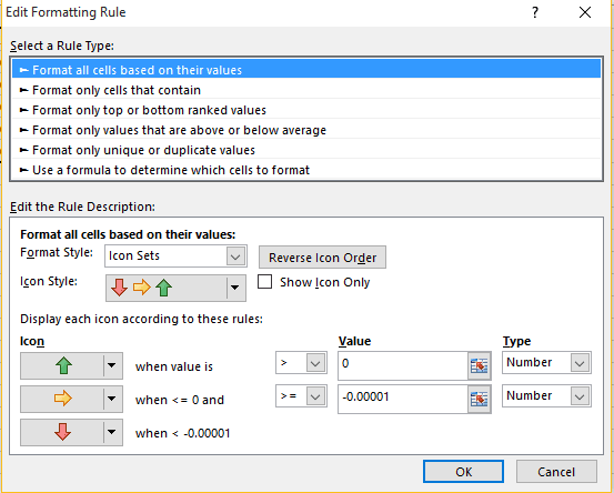
- Click on Edit Rule:
- Set the top value to 0 and change the Type to Number and the operator to >. Set the bottom value to -0.00001 and change the type to Number and the operator to >=.
- Click on OK. Then click on OK on the Rules manager window.
- With the cells still selected click on the % format option on the Number section of the Home ribbon to format the numbers as percentages.
Some Closing Thoughts...
Trend arrows are a great way to bring a small table of figures to life, but conditional formatting has its limits. As the rows multiply and more colleagues need the same numbers, refreshed and reliable, the moment usually comes when the workbook can no longer keep up. That is the point at which teams move their reporting into Power BI, where the same instinct to spot a trend at a glance scales into interactive dashboards.
If your spreadsheets are starting to creak, it may be worth checking for the signs that you have outgrown them. And when you are ready to take your team on the Power BI journey, PTR can help you bring your data to life through dashboards built to grow with you.
If you would like to learn more about Excel why not take a look, at our Excel Training Courses. Or email us if you have any questions at info@ptr.co.uk.
MD
Mandy Doward
Managing Director
PTR’s owner and Managing Director is a Microsoft certified Business Intelligence (BI) Consultant, with over 35 years of experience working with data analytics and BI.


Frequently Asked Questions
Couldn’t find the answer you were looking for? Feel free to reach out to us! Our team of experts is here to help.
Contact Us