Blog Post
Excel is more than a calculator! - Part 2 (Pivot Tables, Pivot Charts & Slicers)

In this article “Excel is more than a calculator! - Part 2” we will be looking at Pivot Tables, Pivot Charts and Filters. If you have never used these before prepare to be impressed!
Microsoft Excel Pivot Tables & Pivot Charts
Pivot Tables and Pivot Charts enable you to explore your data and analyse business measurements in different ways, for example:
- Monthly revenue
- Monthly counts
- Revenue by month and product
In both cases we can work with data interactively and easily change our selected groupings. Perhaps we were looking at product annual revenue and then we want to switch to look at customer annual revenue, but without creating a new table of data and a new chart.
Excel Pivot Tables
Pivot tables and Pivot charts are dynamic and can be based on raw transactional data.
Excel Pivot Charts
So what is the difference between a standard Excel Chart and a Pivot Chart?
Here is what we get if we insert a chart with the table of entrant data selected:
The chart is pretty unusable as every individual record is being represented on the chart (see all the dates along the category (horizontal) axis?). To create a meaningful chart we need to be a little more selective in our data range.
If we select just the Age, Gender and Month columns it looks slightly better:
What you can see is that you need to be a lot more careful with the data and its selection to get a meaningful chart created.
If your intention is to count the number of entries for each gender, age or month and to present this on a chart then you would need to create a summary table first and then create a chart based on the summary data.
For example:
In the above a summary table has been generated showing a count of the number of entries for each month and gender. we have manipulated the data to fit our chart needs.
Pivoting
Instead of having to manipulate the table of data before creating a chart you can create a Pivot Table and/or a Pivot Chart from the raw data.
Pivot Tables enable you to create summary tables of data. Pivot charts enable you to create summary chart representations of data.
Pivot Tables & Charts enable you to drag the values you wish to measure and the items you wish to measure them by into the table or chart to explore data summaries.
To create a pivot table and/or chart highlight the data to pivot on and choose the PivotTable or PivotChart option from the Insert ribbon (PivotChart option selected below):
You can insert a Pivot Table on its own, a Pivot Chart on its own or create both together which can be particularly helpful when the underlying data is quite detailed, as in our example.
Selecting the PivotChart & PivotTable option produces the following dialog:
We will put our Pivot Chart and Pivot Table on to a new worksheet:
You can see that we have a Pivot Table on the left and a Pivot Chart on the right of the worksheet (Sheet4). On the far right is a PivotChart Fields panel. This is where the magic happens. All the fields that are available in the data set (the table) are shown in the top section and can be dragged into the Axis, Category, Values or Filters section below.
The following example shows a table and chart summarising the number of race entries by month and gender. To achieve this you can select either the Pivot Table or the Chart. We have the chart selected here. The Gender field was dragged into the Legend box, The Month field was dragged into the Axis (Categories) box and the ID field was dragged into the Values box (initially this will have a Sum function applied to it, we will deal with this later).
The Pivot Table consists of row groups and column groups and a COUNT of ID values as the values. If you select the Pivot Table the Fields lower panel will look as follows:
The Pivot Chart consists of Months as Categories (horizontal axis of the chart) and Gender as a Series (separate bar for each gender value) and a count of ID values as the values represented by the vertical axis. If you select the Pivot Chart the Fields lower panel will look as follows:
To create this Pivot Table & Pivot Chart pair the fields only needed to be dragged into the areas once as the table and chart are linked.
When you drag a number into the VALUES box you will find that a default aggregate function of SUM is wrapped around the value. If you wish to see a COUNT as in our example you will need to change the function after dragging the value in. To do this left click on the field in the VALUES box (this can be for the Pivot Table or for the Pivot Chart Values) and choose Value Field Settings… from the pop up menu:
Then choose the required function (Count in this example) from the list:
Excel Pivot Table Display Options
Currently we can see the actual counts of how many entries there are for each gender month combination in the Pivot Table. The Pivot Table also has a Totals row and column.
Firstly let's turn our attention to the values. Perhaps you would like to see these represented as a percentage of the totals? If you right click on the Pivot Table you will see the following pop up menu:
These options are also available via the Field Settings dialog (the only way you could do this for a Pivot Chart:
The Show Values As option provides a number of % options. We are going to choose the % of Parent Row Total option. And here is what we get:
Notice that the Pivot Chart has also changed to show the percentage values. The % is based on the monthly split of gender, eg. 27.54% of all female entrants entered in March.
If we change the view to % of Parent Column Total we get this:
This time the % is based on the gender split for a month, eg. 35.71% of all February entries were female.
Filtering Pivot Data
Excel Column & Row Filters
It is possible to filter by the column and row group members for the Pivot Table (or Legend and Axis for the Pivot Chart). You can do this by using the drop down lists provided. See the little arrow next to the labels Column Labels and Row Labels in the above screen shots.
The following example shows just January to March:
The funnel on the drop down icon shows that filtering is in place.
Excel Pivot Table & Chart Filters
Another way of adding filters is to drag a field from the Fields List into the box marked Filters.
This enables a value that is not referenced in the Pivot Table or Chart to be used for filtering. In the following example we add an Age filter:
Clicking on the arrow by the Age filter drop down that is added, on either the Pivot Table or the Pivot Chart enables you to select the ages of interest. When a filter is in place, once again a funnel will be displayed alongside the drop down arrow:
The above screen shot shows the number of male and female entries received in January to March for entrants in their 20s. We can see there is a filter, but not what the data is filtered by unless we Take a look by clicking on the drop down.
Slicers
An alternative to filters that was added in Excel 2010 is slicers.
These have been improved further in Excel 2013. We will look at Excel 2013 slicers here.
You can add a slicer to your workbook by right clicking on the field in the Fields list that you wish to filter on (the Age field in the following example):
Select the Add as Slicer option and a Slicer is added to you current worksheet as shown below (you can move the slicer to a convenient location on the worksheet by dragging it):
Every age value that exists in the data is displayed in the slicer. The above example shows that only 24, 25, 26, 28 and 29 are selected (shaded blue). The reason for this is that they are the only valid age values for the filtered months that we have selected in our Pivot Table and Chart.
If we remove the Month filter the slicer looks as follows:
You might notice that there still appears to be a filter on this slicer (see the funnel icon top right). This is because I had an Age filter on the Pivot Table/Chart earlier (remember we filtered to entrants in their 20s). When I removed the filter from the Pivot Table/Chart the filter actually remained in place and so was represented when I added the Age Slicer.
The slicer can be customised. You can change the colour scheme and the number of columns that appear in the slicer. Click on the slicer to select it and you will see a Slicer Ribbon is now available for selection:
There are some default slicer styles that you can choose from and over on the right hand side you can see that you can define how many columns across you would like. We will set this to 6 and resize the slicer to show all available values.
Having reformatted the Slicer we can now see that the slicer is limiting data to those entrants in their 20s. We will now remove the filter by clicking on the funnel with the red cross on it (top right of the slicer):
To apply new filters to the Pivot Table and Chart all you need do is click on the values in the slicer that you are interested in. Unlike the simple Pivot Table/Chart Filter we can see exactly how the data has been filtered.
The screen shot shows the number of entrants by month and gender for 30, 40 and 50 year olds.
Multiple Filters
You can add as many Slicers as you like to your workbook.
Here we have three slicers, one for Age, one for Gender and one for Month. There is no filtering active yet.
Now we will filter by January to March.
Notice that as soon as the filter for January, February and March is added the Age Slicer has updated to show filtering only for the ages valid for these three months (the unrelated ages are "greyed" out - a lighter blue). There is no filtering visible on the Gender slicer indicating that the selected months consists of male and female entrants. We can, however, choose to filter manually by age or gender. In the following example we have further filtered to entrants who are female and in their 40s.
Filters and Scope
We have added slicers via the Pivot Table/Chart Fields list panel, but slicers are actually workbook scope objects.
When you create them by right clicking on the Field List in a Pivot Table or Pivot Chart they are automatically linked to the Pivot Table or Pivot Chart, but these slicers can then be linked to other Pivot Tables and Charts that you have in your workbook, perhaps even on different worksheets.
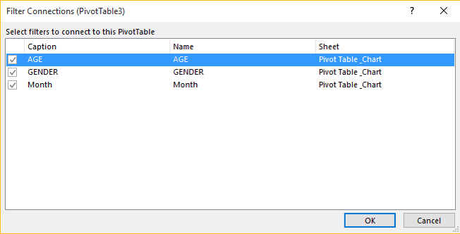
You can check the Slicer Connections via the Filter Connections option on the Pivot Table or Pivot Chart Analyze ribbon:
We can see all three slicers are associated with our Pivot Table here:
I hope you have found this article on Pivot Tables, Pivot Charts and Slicers helpful. Keep an eye out for "Excel is More Than a Calculator - Part 3"!
If you would like to learn more about the secrets of Microsoft Excel why not take a look at the Microsoft Excel Training Courses that we offer: https://www.ptr.co.uk/microsoft-excel-courses.
MD
Mandy Doward
Managing Director
PTR’s owner and Managing Director is a Microsoft certified Business Intelligence (BI) Consultant, with over 35 years of experience working with data analytics and BI.


Frequently Asked Questions
Couldn’t find the answer you were looking for? Feel free to reach out to us! Our team of experts is here to help.
Contact Us