Data Insights
How to Achieve Successful Data Visualisation

Do you remember the days when business data was just a series of digits presented in a variety of formats, none of which seemed to give you an overall understanding of what you were actually looking at?
The emergence of platforms that compile key business stats into easily understood dashboards and reports, mean that various forms of data visualisation are now being adopted by most companies. In fact, you could go as far to say that it is now a pre-requisite for efficient business management.
Here at PTR, we are experts in all things data – and we could talk for hours about what needs to be done before your data is ready to be presented in any visual form. But, just for now, let’s focus on what many businesses consider to be the end result of all that work on collecting, storing and managing their data: its final presentation to the people who need to know.
Regardless of the platform you decide to use, or the visualisation format you eventually decide on, there are a number of things you need to carefully consider to make sure the final result is the right one for your business. Having spent over 20 years working with clients to get the most from their data, we feel well-placed to offer these following suggestions.
- Make sure you have the right human resource in place.
Not only do you need to make sure that those building the reports are capable of providing accurate reports that can appropriately adapt to business needs, you also need to ensure that they are able to meet the demand of business deadlines. As users throughout the organisation become aware of how useful visualised reports are, demand is likely to increase, and you need to know you have the bandwidth to cope.
- Engage with your users to understand their needs and manage their expectations.
With an increase in demands it is important that your data builder 1. Knows exactly what information needs to be presented and when 2. Have a clear understanding of business priorities. This knowledge can only come from the users themselves, so spending some time as an organisation in thrashing out these issues, will save a lot of time further down the line.
- Aim for uniformity of dashboard throughout the organisation
A lot of build time can be saved by creating a standardised format of presentation for your business and will stop your builders having to start from scratch every time a new report is requested. In our experience, style sheets are a great way of achieving a consistent approach of presenting information across the business, whilst allowing the flexibility needed to adapt to differing business functions
- Keep your data up-to-date and relevant
Don’t let fancy reports distract you from the foundation of your BI process: keeping all aspects of data management to a standard that provides your business with the accurate information it needs.
- Make sure you have a data visualisation tool that meets the needs of your business.
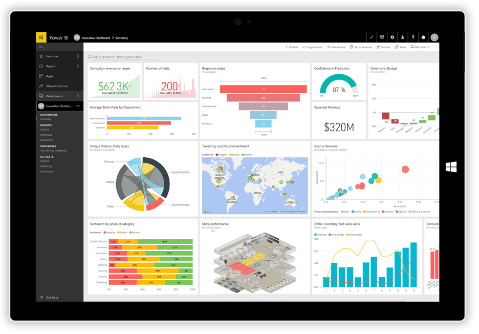
At PTR we have yet to find a better tool than Microsoft Power BI, which easily captures, assembles and presents data from diverse sources. The BI solution offers dashboards that deliver interactive panels – displaying Big Data information sets through to smaller tiles. It also supports robust data analytics reporting, including pre-defined templates and the ability to customise reports for specific requirements.
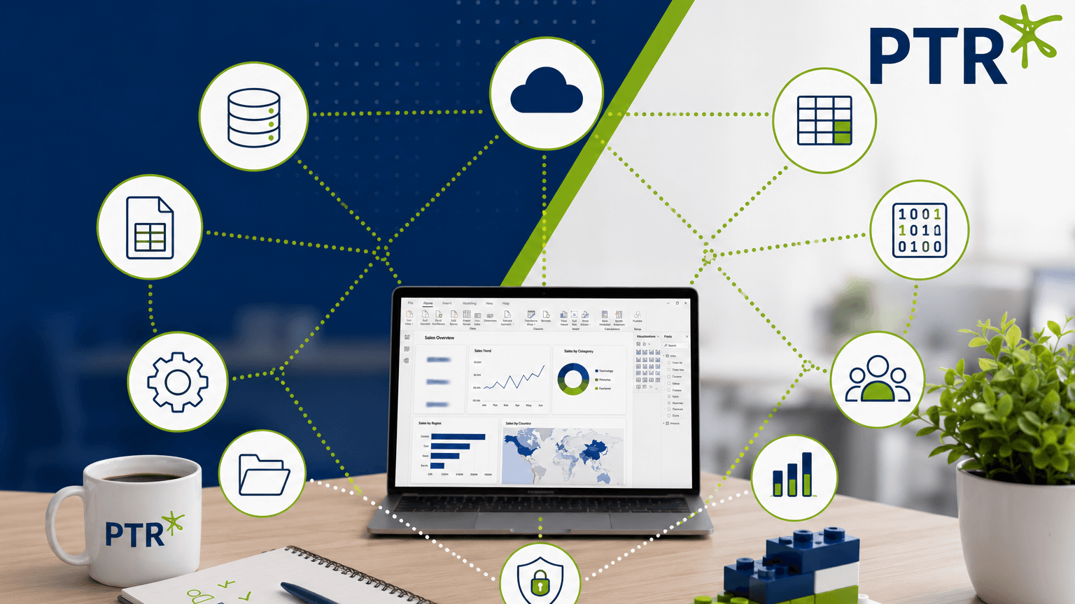
PTR can help you with all aspects of presenting your data in the most suitable way for you and your business. From collating data from different sources into manageable, secure warehouses, through to creating easy to use dashboards and reports that all your staff can use – our decades of experience will ensure you bypass possible pitfalls, providing a seamless transition to meaningful Business Information for your organisation. Still not sure? Why not get in touch to book a FREE, no obligation, Data Assessment to see how we can help your business today.
IR
Ian Roberts
Technical Director
Ian is an incredibly talented solutions architect. He has over 15 years of experience working with data, as part of a broader IT career spanning over 20 years.

Frequently Asked Questions
Couldn’t find the answer you were looking for? Feel free to reach out to us! Our team of experts is here to help.
Contact Us