Tech Tips
Quick wins for moving from spreadsheets to more structured analytics
There are simple steps you can take right now to move away from spreadsheets and start seeing quick wins.

Data is everywhere within our businesses - not just in core applications but scattered through our emails, local drives, and most commonly, spreadsheets. While these spreadsheets often become the backbone of a company’s analytics, they can quickly become unwieldy. Multiple versions of the same file are often updated by different people, sometimes creating a messy tangle that makes it hard to get a clear, consistent view of the business. Managing all these sheets adds unnecessary overhead, slows decision-making, and increases the risk of errors.
While it is easy to list the benefits of moving to a more structured analytics approach it can be harder to understand where to start.
Luckily it doesn’t have to be complicated.
You don’t need to redesign your entire reporting platform to see value quickly. Even if a full Data Warehouse or medallion Lakehouse is your long-term goal, there are simple steps you can take right now to move away from spreadsheets and start seeing quick wins.
Step 1: Build lightweight dashboards from existing sheets
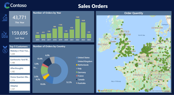
Before considering making any changes to your spreadsheets, a fast way to get more value from your data is to increase interactivity by building a dashboard powered directly from your sheets.
Instead of static tables and charts, you’ll have drill-downs, filters, and the ability to slice data by different views while using the same files you are already working with.
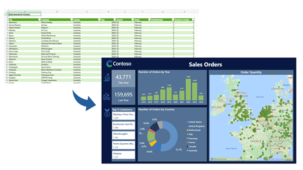
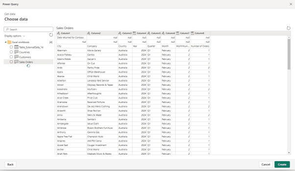
Simply create a new dashboard in Power BI Desktop using your Excel sheet as a data source and then publish it to the Power BI Service to share with others in your business. Power BI can automatically summarise your data and generate key metrics without needing deep understanding of code, and its Copilot feature guides you step by step in building an effective dashboard.
Step 2: Develop a Semantic Model
The next quick win is to make sure your dashboards stay up to date. By publishing your Excel file as a semantic model in Power BI, you link your dashboards directly to the source data. This means when someone updates the spreadsheet, a scheduled refresh of the semantic model will make the dashboard reflects those changes - no need to re-export or rebuild visuals. It’s a simple step that reduces the manual overhead of refreshing reports and makes your analytics far more reliable.
This also enables you to begin expanding your modelling by merging in multiple source spreadsheets, creating re-usable measures and standardising business definitions for key KPIs. Having consistent metrics applied across multiple dashboards is vital for eliminating confusion and providing a single source of truth.
Step 3: Export data into OneLake
As your analysis needs grow you might want to experiment with Python or R or explore data science platforms like Databricks. The natural next step is to consolidate your source files in OneLake, Microsoft Fabric’s central data hub. By dropping existing Excel or CSV files into OneLake, they become discoverable not just for BI tools like Power BI, but also for machine learning, notebooks, and advanced analytics.
If you are storing data in Azure Data Lake Storage (ADLS) Gen2 , AWS S3 or Dataverse, OneLake Shortcuts let you virtually connect to your existing locations, giving you centralised access without disrupting where the files currently live.
Step 4: Let Lakehouse structure your data
Going a step further and storing Excel and csv files in a dedicated Lakehouse within OneLake provides a structured, queryable layer on top of your data. Unlike simply dropping the files in OneLake, a Lakehouse automatically organises your data into tables and schemas. This delivers the ability to analyse data with tools such as SQL, Python, or Spark, without needing to understand database administration.
Step 5: Replace data exports with Fabric Dataflows
Fabric Dataflows take things a step further by connecting directly to your source systems (CRM, ERP, Databases, SharePoint) and automating the refresh cycle. This keeps your Lakehouse up to date without having to copy and paste data files into OneLake. Dataflows not only transfer data but also allow you to transform, clean and merge it before it reaches your reports. This ensures that every dashboard, across every team, is built on consistent, trusted, and up-to-date data.
Dataflows will elevate your analytics from being dependent on spreadsheets to being part of a true data pipeline that gives your business a scalable, automated foundation for reporting and advanced analytics.
Start Your Move from Excel to Power BI
These five steps build on each other, but you don’t need to do them all at once. Even starting with the first one — turning an existing spreadsheet into a Power BI dashboard — can deliver immediate value while setting the foundation for a structured analytics approach.
The key is to begin small and focus on high-impact datasets. Don’t attempt to move everything at once but instead choose one spreadsheet-driven process and go from there. Those first quick wins will soon compound, creating momentum and confidence for bigger changes.
SB
Stephanie Butchart
Senior Business Intelligence Consultant
An MCSA-certified BI Consultant with 8 years' experience, Stephanie is proficient and knowledgeable across Microsoft technologies with a full range of platforms - from traditional on-premise data warehousing through to Azure BI solutions and Power BI.


Frequently Asked Questions
Couldn’t find the answer you were looking for? Feel free to reach out to us! Our team of experts is here to help.
Contact Us