Tech Tips
Building Engaging and Insightful Sales Dashboards with Power BI
Power BI Sales Dashboards That Tell A Story An enormous amount of effort goes in to gathering data from different parts of the business, cleansing and transforming it before integrating it into a single, central one-truth repository for all to use. The fi

Power BI Sales Dashboards That Tell A Story
An enormous amount of effort goes in to gathering data from different parts of the business, cleansing and transforming it before integrating it into a single, central one-truth repository for all to use. The final part of the your business data journey is bringing your data to life with well designed and intereactive dashboards.
What makes a dashboard different to a report?
A report takes you on a data journey that is mapped out and planned by the report author to bring to a fixed and predefined data story. You know the question you are trying to answer before you start.
A dashboard enables you to plan your own data journey, to set your own destinations and to take a different route through your data every time. With a well designed dashboard you can ask different questions of your data (often thinking of new questions along the way), and unlock stories that give powerful insight into your business processes, performance and trends.
Try It Out!
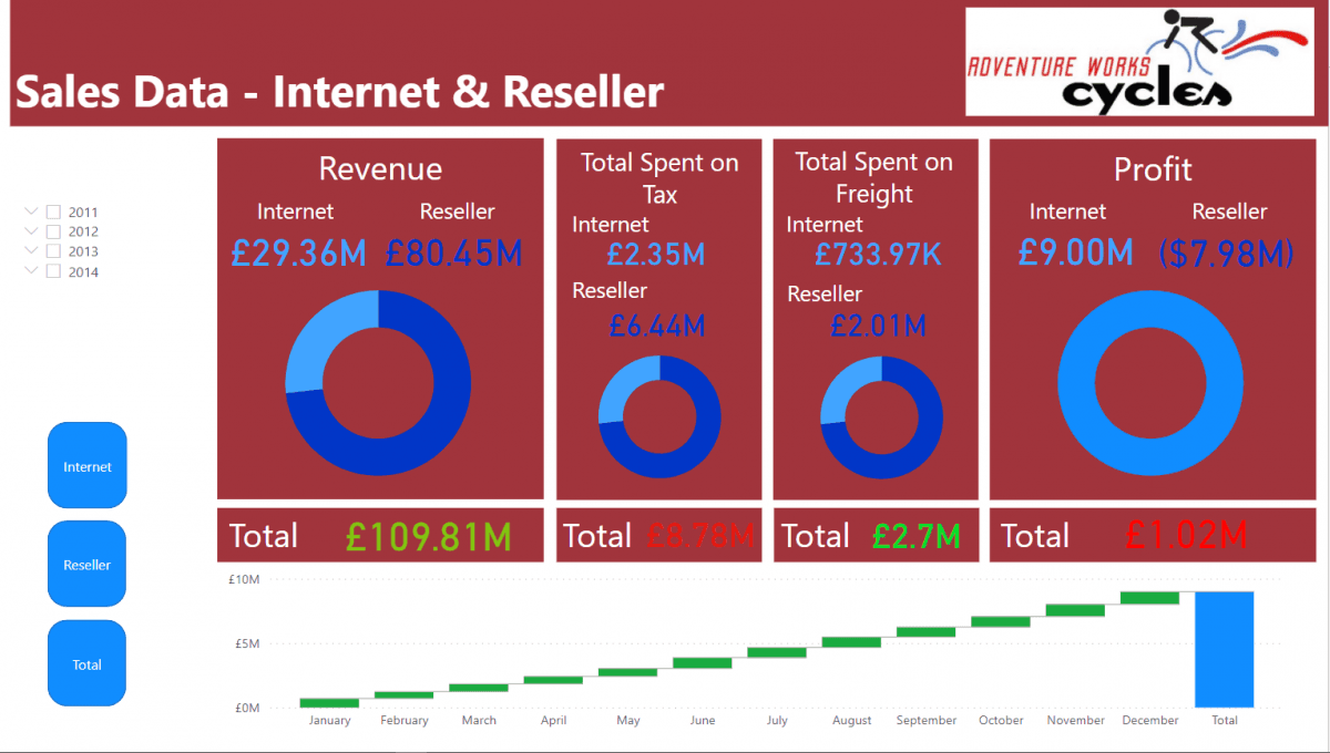
Our newest recruit, Peter, has been busy learning how to prepare data and build Power BI dashboards and his latest creation is based on sales data from the good old AdventureWorks database. Try it out and experience the interactive world of Power BI with this Demo Sales Dashboard. You can view data by sales type, country or product. You can click on bar chart bars, treemap segments, table rows to see the interactive nature of Power BI dashboards, and you will see a variety of visual styles in action.
If you would like to talk to us about how our Business Intelligence and Power BI Consultancy services can help you with your data, reporting and analytics requirements email info@ptr.co.uk .
We also have a range of Power BI training courses, and Data Driven Decision Making training courses run virtually or face to face, that will help you and your team gain the skills to enable you to begin your data journey.
MD
Mandy Doward
Managing Director
PTR’s owner and Managing Director is a Microsoft certified Business Intelligence (BI) Consultant, with over 35 years of experience working with data analytics and BI.


Frequently Asked Questions
Couldn’t find the answer you were looking for? Feel free to reach out to us! Our team of experts is here to help.
Contact Us