Tech Tips
Building Incident Frequency and Costs Power BI Dashboards
Telling Stories From Fly Tipping Data We work with a wide and varied selection of data sources and relish the challenge of finding ways of importing data into an integrated, trustworthy business model that can service all of your analytics and reporting n

Telling Stories From Fly Tipping Data
We work with a wide and varied selection of data sources and relish the challenge of finding ways of importing data into an integrated, trustworthy business model that can service all of your analytics and reporting needs.
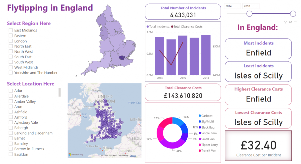
We put Peter to work again on developing an insightful dashboard around Government data on fly tipping. His challenge was to see how many questions and answers you get from a single page dashboard.
The base data includes incident dates, locations, waste types and costs associated with these incidents provided in separate CSV files downloaded from the Government Open Data site. How many insights can we get from this?
Try It Out!
Well take a look at the demo Fly Tipping Dashboard and have a play. You can intereact with slicers, click on bar chart bars or map locations to see different views of the data and watch the visuals change to reflect your selections. And notice the tooltips that appear as you move your mouse across the visuals, offering more explanations for the make up of the visible numbers and trends.
If you would like to talk to us about how our Business Intelligence and Power BI Consultancy services can help you with your data, reporting and analytics requirements email info@ptr.co.uk .
We also have a range of Power BI training courses, and Data Driven Decision Making training courses run virtually or face to face, that will help you and your team gain the skills to enable you to begin your data journey.
MD
Mandy Doward
Managing Director
PTR’s owner and Managing Director is a Microsoft certified Business Intelligence (BI) Consultant, with over 35 years of experience working with data analytics and BI.


Frequently Asked Questions
Couldn’t find the answer you were looking for? Feel free to reach out to us! Our team of experts is here to help.
Contact Us