Microsoft Power BI: Report Design Ideas and Tips
Power BI Report Design Ideas
PTR is proud to provide Microsoft Power BI consultancy services to help you and your business get the most from your data but when only a quick answer will do, here is the latest in our series of bite-sized guides for Power BI, looking at report design ideas and tips.
Do you wonder how to get ideas for your report design – want to get great looking reports every time? Here are some tricks to make your life easier so you can build stylish and professional reports in Microsoft Power BI to impress your colleagues and stakeholders. So let’s get started with our Microsoft Power BI report design ideas and tips.
First principles for design
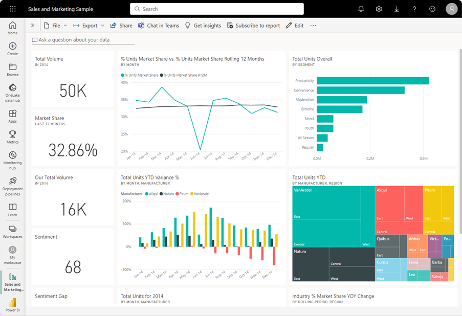
Remember when designing your reports that you want to showcase your most important data, so choose something that is interesting to look at while also communicating your key points clearly. Does the most important information stand out? Also remember that Power Bi is an analysis tool.
Users should be able to see a top line figure then be able to find out what were the drivers behind the number. Simply showing a table of numbers is not as engaging to your users.
Don’t get over excited by bells and whistles. Visualizations should tell a story and be easy to grasp. A simple graph may be sufficient. If you need something more elaborate then use a combination of tiles, colour and any other customizations you can think of to help the reader.
Don’t feel like you have to re-invent the wheel. Not everyone is a design pro so let others inspire you!
Microsoft have a great video on design best practice which you can watch here. It includes 15 rules for creating a great dashboard. Give it a watch.
Microsoft themselves have design templates, themes and colour schemes for you to try within the tool or you can search the web for examples of dashboard templates to get you inspired. You could look at adobe stock images by searching on dashboards. Choose from different colour schemes and layouts to get creative. Microsoft also have a store of custom visuals so you can find one that is perfect for your requirements which may never have been seen by your users before. WordCloud is a great example of this.

Colour Scheme
The simplest way to build your reports is to use the Power BI built-in report themes which offer a selection of predefined colour schemes provided by Microsoft. Select your report theme from the Power BI Desktop menu.
Or you can create custom report themes by editing a current theme and saving it using the Customize theme dialogue or by creating your own custom theme using a JSON file.
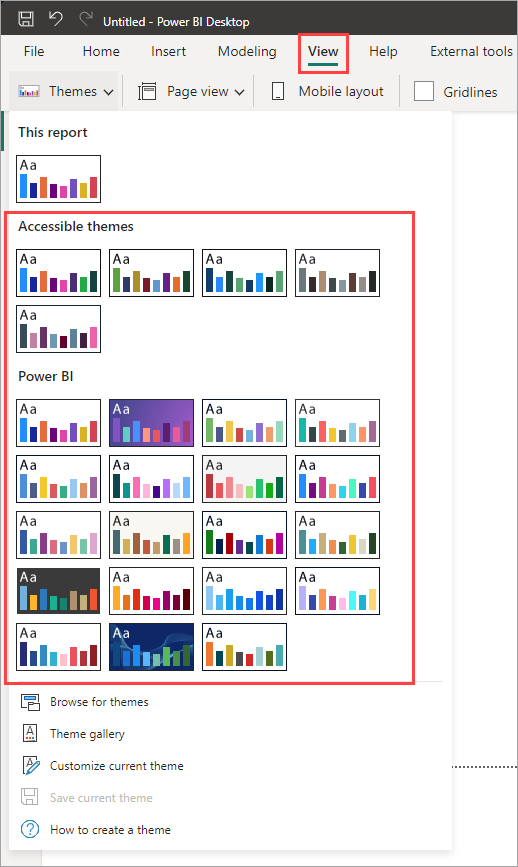
The Themes Gallery is the perfect place to find themes designed within the user community and can provide you with holiday themes or colour schemes which are easy on the eyes for people with accessibility needs. You can visit the themes gallery here.
Alternatively, if you want to go outside the Microsoft eco-system then the open-source extension eye dropper allows you to match colours from webpages. This can be taken one step further using the matched colours to create a custom colour pallet using one of the many colour palette generators online.
Icons
Power BI gives you some icons that you can drag and drop into your dashboards. Get them by navigating to the Insert tab and Elements groups. Choose buttons or shapes and re-size as needed. Or you can import icons from a third-party website if you prefer using Insert image. The Buttons also have a handy navigator bar that allows you to create custom navigation panels to help your users navigate through your reports.
The image needs to be in one of these file formats: .bmp, .jpg, .jpeg, .gif, .png, or .svg.
The URL must be accessible and not hosted on a site that needs you to sign-in, for example SharePoint or OneDrive.
If you want to take it one step further and integrate dynamic data with images in Power BI, try using conditional formatting which will alter the image displayed according to conditions chosen by you. To do this define all the values in a column as image URLs and then use publicly hosted image URLs to populate that column to dynamically.
Spacing and Layout
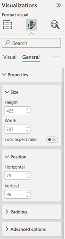
For a professional finish why not use the features within the visual to place your visuals on the page with mathematical precision. Your users will appreciate the work! Simply access your visual and adjust the Size and positions to line everything up perfectly.
Custom Visuals
Custom Visuals can be found in the visualisation pane by clicking the elipse and pressing get more visuals.
We hope you found these tips and ideas useful. Please get in touch if you would like to explore our range of Power BI consultancy services We also run a comprehensive range of training courses from getting started with Power BI and Microsoft Fabric to an introduction to DAX
Take a look at our wide range of training courses here.
When you examine the dataset example shown here there are columns with month names which are text but if you look along the rows there is also a month number column. The field TheMonthNumber is what we want here. To solve our problem we want to order the numbers sequentially. So select the ‘Month’ column and order it by the ‘Month Number’ column.
We offer a blended consultancy and training approach to helping you with your Power BI Data Journey: Microsoft Azure BI Solutions Training, Data Strategy Consulting, Data Analytics Consulting, Power BI consulting and Microsoft Fabric Consulting and that’s just for starters. Please contact us for your bespoke training course.
Please contact info@ptr.co.uk to find out how we can help you.